Table of Contents >> Show >> Hide
- How to Pick the Right Bedroom Color Scheme (Without Losing Your Mind)
- 30 Brilliant Bedroom Color Schemes to Inspire Your Space
- 1. Soft White + Sand + Camel
- 2. Greige + Ivory + Matte Black
- 3. Misty Blue + Cloud White + Natural Oak
- 4. Sage Green + Cream + Walnut
- 5. Dusty Rose + Warm White + Brass
- 6. Navy + Fog Gray + Caramel Leather
- 7. Charcoal + Bone + Smoked Bronze
- 8. Terracotta + Clay Beige + Cream
- 9. Olive + Putty + Black
- 10. Eucalyptus + Stone + Light Wood
- 11. Lavender Gray + Warm White + Taupe
- 12. Deep Plum + Mushroom + Gold
- 13. Sky Blue + Linen + Rattan
- 14. Seafoam + Driftwood + Ivory
- 15. Teal + Sand + Antique Brass
- 16. Blush Beige + Taupe + Espresso
- 17. Peach Cream + Ivory + Soft Sage
- 18. Buttercream + Warm White + Cinnamon
- 19. Mocha + Latte + Cream
- 20. Chocolate Brown + Dusty Blue + Ivory
- 21. Off-Black + Chalk White + Walnut
- 22. Cocoa + Camel + Stone Gray
- 23. Slate Blue + Silver Sage + White
- 24. Dusty Coral + Clay + Linen
- 25. Rust + Moss Green + Oatmeal
- 26. Mustard Ochre + Charcoal + Cream
- 27. Powder Blue + Warm Gray + White Oak
- 28. Warm White + Berry + Ink Blue
- 29. Layered Greige + Mushroom + Flax
- 30. Soft White + Forest Green + Natural Linen
- How to Make Any Bedroom Color Scheme Look Expensive
- Extended Experience Notes (Approx. )
- Conclusion
Your bedroom should feel like a deep exhale, not a group project between ten random paint chips. If you’ve ever stood in a paint aisle whispering, “Is this beige… or emotionally complicated gray?” you’re in the right place. This guide gives you 30 bedroom color schemes that are practical, stylish, and actually livablefrom airy neutrals and coastal calm to moody drama and earthy warmth.
These ideas are built to help you choose paint colors, bedding tones, woods, metals, and accent shades that work together in real life. You’ll also get quick strategy tips so your space doesn’t look perfect on Pinterest and chaotic in person. Whether you’re decorating a primary bedroom, guest room, or tiny city sleep cave, these combinations are designed for comfort, personality, and excellent naps.
How to Pick the Right Bedroom Color Scheme (Without Losing Your Mind)
1) Start with mood, not paint chips
Ask one question first: How do I want to feel in this room at 10:30 p.m.? Calm and cocooned? Bright and optimistic? Moody and hotel-luxe? Your mood goal narrows the palette instantly and prevents “rainbow by accident.”
2) Let natural light lead the plan
North-facing rooms often feel cooler, so warm undertones can keep them from feeling flat. South-facing rooms are warmer and can handle cooler neutrals beautifully. In small bedrooms, lighter values usually help the room feel more open, while darker colors can create intentional coziness.
3) Use the 60-30-10 rule
Think of your bedroom palette like a well-dressed outfit: 60% dominant color (usually walls and large surfaces), 30% secondary color (bedding, rug, curtains), and 10% accent color (pillows, art, decor). This keeps things balanced and avoids visual noise.
4) Test before commitment
Paint samples on at least two walls and check them morning, afternoon, and night. The same “perfect greige” can look buttery at noon and suspiciously purple after sunset. Paint is moody. Plan accordingly.
30 Brilliant Bedroom Color Schemes to Inspire Your Space
1. Soft White + Sand + Camel
A timeless, airy neutral bedroom color scheme. Soft white walls, sandy textiles, and camel leather accents feel clean but not sterile. Add black picture frames for definition and wood nightstands for warmth.
2. Greige + Ivory + Matte Black
For modern minimalists: greige walls anchor the room, ivory bedding softens it, and matte black lighting adds edge. This palette feels elevated, quiet, and very “I alphabetize my spice rack.”
3. Misty Blue + Cloud White + Natural Oak
A classic calming bedroom palette. Misty blue walls pair with white bedding and light oak furniture for a fresh, breathable look. Ideal for smaller bedrooms that need visual lift.
4. Sage Green + Cream + Walnut
Sage is the friendly overachiever of bedroom paint colors. It looks fresh in daylight and cozy at night. Pair with cream linens and walnut wood to create a grounded, nature-inspired retreat.
5. Dusty Rose + Warm White + Brass
Soft, romantic, and surprisingly versatile. Dusty rose acts as a muted neutral when balanced with warm white walls and brushed brass accents. Add textured throws to keep it sophisticated, not sugary.
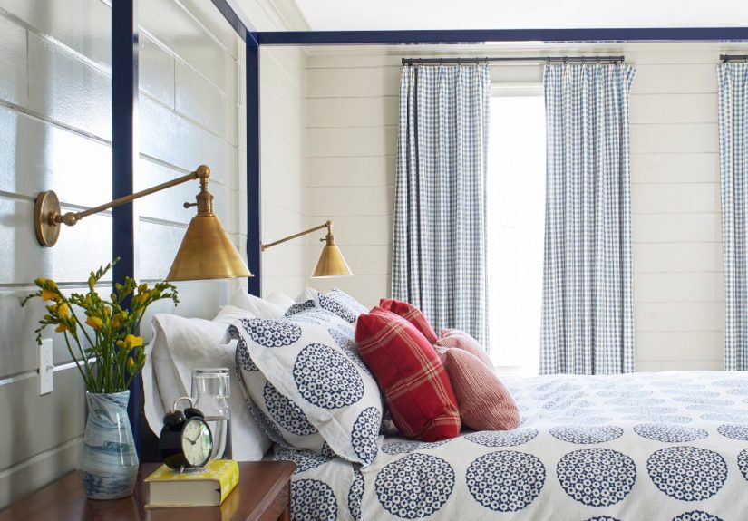
6. Navy + Fog Gray + Caramel Leather
Deep navy adds instant depth and polish. Fog gray softens the contrast while caramel leather brings warmth. This moody bedroom color scheme works especially well with crisp white trim.
7. Charcoal + Bone + Smoked Bronze
Dark but not gloomy. Charcoal walls feel enveloping, bone bedding adds contrast, and smoked bronze hardware introduces subtle shine. Great for a dramatic bedroom that still feels restful.
8. Terracotta + Clay Beige + Cream
Earthy and sunbaked, this palette feels warm and lived-in. Use terracotta as an accent wall, clay-beige textiles, and creamy bedding to balance richness with softness.
9. Olive + Putty + Black
Olive green plus putty neutral creates a tailored, slightly masculine vibe. Black accents sharpen the palette. Works beautifully with linen curtains and a vintage-style rug.
10. Eucalyptus + Stone + Light Wood
If your dream bedroom says “spa, but make it practical,” try eucalyptus walls with stone-toned bedding and pale wood furniture. Calm, modern, and easy to accessorize.
11. Lavender Gray + Warm White + Taupe
A subtle twist on neutral: lavender-gray walls look elegant and soft, especially in evening light. Layer warm white bedding and taupe upholstery for a gentle, cocoon-like effect.
12. Deep Plum + Mushroom + Gold
Plum adds luxury without going full theater stage. Mushroom neutrals stabilize it, while gold details add glow. Keep textures matte to avoid visual overload.
13. Sky Blue + Linen + Rattan
Bright, optimistic, and casually coastal. Sky blue walls plus linen bedding and rattan accents create a breezy vibe that feels vacation-ready all year.
14. Seafoam + Driftwood + Ivory
This bedroom color palette is quiet and restorative. Seafoam walls, driftwood tones, and ivory bedding deliver a light, tranquil look that suits both modern and cottage styles.
15. Teal + Sand + Antique Brass
Teal is bold yet serene when paired with sandy neutrals. Antique brass lamps or curtain rods bring character. Great for renters using color through bedding and accessories.
16. Blush Beige + Taupe + Espresso
Blush beige walls feel warm and flattering, especially with taupe textiles and dark espresso furniture. This palette reads polished and grown-up, not overly sweet.
17. Peach Cream + Ivory + Soft Sage
A gentle, uplifting scheme for guest rooms or primary suites. Peach-cream undertones warm the space, ivory keeps it light, and soft sage accents add balance.
18. Buttercream + Warm White + Cinnamon
Cheerful but sophisticated. Buttercream walls provide glow, warm whites keep things airy, and cinnamon-toned wood accents deliver cozy contrast.
19. Mocha + Latte + Cream
The coffee-shop palette that always works. Mocha anchors, latte bridges, cream brightens. Add boucle or woven textures for a plush, layered bedroom aesthetic.
20. Chocolate Brown + Dusty Blue + Ivory
Rich brown can feel surprisingly restful with cool dusty blue and soft ivory. Use brown in furniture or one wall, not every surface, to keep the room balanced.
21. Off-Black + Chalk White + Walnut
Graphic and chic. Off-black walls set a dramatic tone, white bedding adds contrast, and walnut tones prevent the room from feeling stark. A favorite for modern design lovers.
22. Cocoa + Camel + Stone Gray
This warm neutral bedroom scheme looks designer-level with minimal effort. Combine cocoa textiles, camel upholstery, and stone-gray walls for a refined, layered effect.
23. Slate Blue + Silver Sage + White
Two cool hues, one soothing result. Slate and sage feel fresh together without becoming pastel. White trim or bedding keeps the palette crisp and clean.
24. Dusty Coral + Clay + Linen
For people who want color without chaos. Dusty coral adds personality, clay tones ground it, and linen neutrals keep things breathable and relaxed.
25. Rust + Moss Green + Oatmeal
A rich earthy palette with serious personality. Rust and moss echo nature; oatmeal softens the look. Pair with wood, jute, and matte ceramics for cohesion.
26. Mustard Ochre + Charcoal + Cream
Creative and bold, but still bedroom-appropriate. Use mustard in textiles and art, charcoal as structure, cream as the visual pause button.
27. Powder Blue + Warm Gray + White Oak
A transitional style winner. Powder blue calms, warm gray modernizes, and white oak adds softness. This palette handles both traditional and contemporary furniture.
28. Warm White + Berry + Ink Blue
Mostly neutral with a juicy twist. Warm white walls create a clean base while berry and ink-blue accents add depth and playful contrast.
29. Layered Greige + Mushroom + Flax
If you love neutrals, go tonal instead of flat. Layer several warm neutralsgreige, mushroom, and flaxto create depth without using high-contrast color.
30. Soft White + Forest Green + Natural Linen
A crisp foundation with grounded accents. Soft white brightens the room while forest green in pillows, art, or upholstery adds calm sophistication. Linen keeps it effortless.
How to Make Any Bedroom Color Scheme Look Expensive
- Repeat your accent color three times: for example, pillow, art, and a throw.
- Mix textures, not just colors: linen, wood, velvet, metal, and woven fibers add depth.
- Choose the right white: warm whites for cozy spaces, crisp whites for modern contrast.
- Use dark colors intentionally: one accent wall or all walls with lighter bedding for balance.
- Keep undertones consistent: avoid combining cool gray paint with warm yellow-beige textiles unless contrast is deliberate.
Extended Experience Notes (Approx. )
Over the years, I’ve noticed that bedroom color success has almost nothing to do with “the hottest color of the year” and everything to do with context. I once helped a friend pick what looked like a perfect cool gray online. In the store, it was elegant. On her north-facing bedroom walls, it turned into “storm cloud at tax time.” We pivoted to a warmer greige with similar depth, and suddenly the room felt intentional instead of icy. Same furniture, same layout, totally different emotional response.
Another memorable project was a tiny apartment bedroom with one skinny window and almost no daylight. The owner wanted dark navy because she loved dramatic interiors on social media. Instead of saying no, we said “yes, but strategically.” We used navy on the wall behind the bed only, then kept the other walls a soft warm white, added ivory bedding, and layered brass sconces and caramel throw pillows. Result: moody focal point, but still bright enough to find your socks before work.
I’ve also seen people underestimate undertones. One couple bought beige curtains, beige bedding, and beige paint and still couldn’t figure out why the room looked chaotic. The culprit: five different undertones fighting each otherpink beige, green beige, yellow beige, and two mystery beiges from another dimension. Once they standardized the undertone family, the room looked instantly calm, even before adding new decor.
In guest rooms, my favorite move is a soft neutral wall plus one personality accent color. Guests feel comfortable because the base palette is restful, but the room still has charm. Sage, dusty blue, and muted terracotta are especially good here because they read welcoming across seasons. No one has ever checked out of a guest room and said, “Loved it, but could you add more neon?”
For families with kids or pets, color planning should include durability and maintenance. Mid-tone colors can be forgiving, especially near headboards or in rooms with frequent use. Super-light walls can show scuffs quickly; super-dark walls can show dust and fingerprints. There’s no wrong choicejust trade-offs. When people know the trade-offs in advance, they’re happier with their final palette six months later.
I’ve also seen the emotional side of bedroom color choices. One client chose soft eucalyptus and cream after a stressful year, and she told me the room felt like a reset button every evening. Another chose deep plum and mushroom because she wanted a space that felt personal and cocooned, not generic. Both projects worked because the palette matched the person, not just a trend report.
The biggest lesson: choose colors you can live with at 7 a.m. and 11 p.m., in pajamas and in real life. A beautiful bedroom color scheme is not just photogenicit supports how you rest, recharge, and show up the next day. If your palette helps you breathe deeper the moment you walk in, you nailed it.
Conclusion
The best bedroom color schemes combine mood, light, undertone harmony, and a little courage. Whether you go airy with whites and sand, earthy with terracotta and olive, or dramatic with navy and plum, the goal is the same: create a space that helps you feel restored. Use the 30 palettes above as your shortcut, then personalize with texture, lighting, and meaningful accents. Your bedroom doesn’t need to be trendy to be stunningit just needs to feel like yours.