Table of Contents >> Show >> Hide
- Why Bathroom Paint Goes Wrong So Fast
- 1. Stark, Cold White
- 2. Muddy Beige, Drab Brown, and Dingy Greige
- 3. Neon and Overly Vibrant Brights
- 4. Mustard Yellow and Other Overheated Yellows
- How to Choose a Better Bathroom Paint Color
- The Colors That Usually Work Better
- Conclusion
- Real-Life Experiences With Bathroom Paint Regret
If the bathroom is where you begin and end your day, it probably should not feel like a haunted motel, a fluorescent fast-food restroom, or a sad beige waiting room for lost shampoo bottles. Yet that is exactly what happens when the wrong paint color lands on the walls. Bathrooms are sneaky little rooms. They are usually smaller than other spaces, they often have tricky lighting, and they are packed with bright white fixtures that can make a perfectly decent color suddenly look harsh, dingy, or weirdly green.
That is why choosing bathroom paint is not just about chasing trends. It is about understanding how color behaves in a humid, reflective, high-traffic room. Designers and home experts keep repeating the same warning: some shades make a bathroom feel smaller, colder, gloomier, or more dated almost the minute the roller dries. A color that looks sophisticated in a living room can turn into a full-blown regret project once it meets tile, vanity lights, mirrors, and steam.
So let’s talk about the bathroom paint colors that can wreck the vibe fast. Below are four offenders that repeatedly show up on designers’ “please do not do this to your walls” list, plus better alternatives that will help your bathroom feel cleaner, calmer, and a whole lot more expensive.
Why Bathroom Paint Goes Wrong So Fast
Before we name names, here is the short version: bathrooms magnify paint mistakes. Small spaces intensify color. Artificial lighting can pull out odd undertones. Glossy surfaces like mirrors, faucets, and tile bounce color all over the room. And because many bathrooms have limited natural light, a shade that felt subtle on a paint chip can become gloomy, harsh, or muddy in real life.
In other words, bathroom color mistakes are not subtle. They announce themselves with confidence.
1. Stark, Cold White
Why it can ruin your bathroom instantly
White sounds safe. White sounds timeless. White sounds like the responsible adult in the paint deck. But a stark, icy white can make a bathroom feel sterile, clinical, and strangely unfriendly. Instead of reading as crisp and clean, it can look like the room was designed by a dentist with a personal grudge against comfort.
This is especially true in bathrooms with cool LED bulbs, chrome fixtures, and little natural light. In that setup, bright white paint often reflects light in a harsh way, flattening the room and making it feel cold rather than refreshing. It can also exaggerate every shadow, which is not doing your morning mirror check any favors.
Where it goes wrong
Imagine a small bathroom with a white vanity, white toilet, white tub surround, and bright white walls. Instead of layered and elegant, the room can feel one-note and overexposed. The surfaces blur together. The architecture disappears. The space loses warmth and depth.
It gets worse when the undertone is too blue. Suddenly your bathroom feels less “spa retreat” and more “please fill out these insurance forms.”
What to use instead
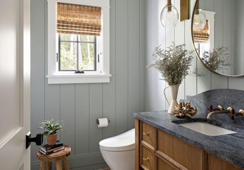
If you love white, go warmer and softer. Think creamy white, mineral white, off-white, or a white with subtle beige, taupe, or greige undertones. These shades still feel clean, but they are kinder to skin tones, more forgiving under artificial light, and much easier to pair with wood vanities, brass fixtures, and stone finishes.
A warm white bathroom says, “I have my life together.” A cold, glaring white bathroom says, “I alphabetize my stress.”
2. Muddy Beige, Drab Brown, and Dingy Greige
Why it can ruin your bathroom instantly
There is a big difference between a beautiful warm neutral and a muddy neutral that looks like it gave up. Drab beige, murky khaki, flat taupe, and certain muddy greiges can suck the life out of a bathroom at record speed. Instead of cozy, they read tired. Instead of grounded, they look dirty. Instead of sophisticated, they feel like the room has not had an opinion since 2008.
Bathrooms need clarity. When a color looks too indecisive, too dusty, or too brown-gray-green all at once, it can make the entire room feel dim and outdated. This is especially obvious next to white sinks and bathtubs, which can make muddy wall colors look even dingier by comparison.
Why these neutrals are tricky
Neutral does not automatically mean foolproof. In a bathroom, undertones matter more than people expect. A beige with too much yellow can feel muggy. A greige with too much green can look sickly. A brown that looked rich in a fan deck can land on the wall looking like wet cardboard. That is not the luxury mood most people are after.
Designers often point out that these muddier shades can also make a small bathroom feel visually cramped. Because the color lacks freshness and contrast, the space can appear heavier and darker, even when the square footage has not changed.
What to use instead
Reach for clean, warm neutrals with clearer undertones. Soft mushroom, pale taupe, creamy sand, and light warm gray can all work beautifully when they are not too murky. If you want more personality, muted sage, soft blue-gray, or a gentle green can give the bathroom depth without making it feel dated.
Think of it this way: warm neutral, yes. Muddy neutral that looks like old oatmeal, no.
3. Neon and Overly Vibrant Brights
Why they can ruin your bathroom instantly
A bathroom is usually where people want to wake up gently, get ready in decent lighting, and perhaps enjoy one uninterrupted minute of peace before life begins yelling. Neon green, electric pink, bright orange, and similarly loud hues do not help with that mission. These colors can overwhelm a small space, bounce aggressively off mirrors and tile, and make the whole room feel more chaotic than chic.
Sure, a vivid color can look fun in tiny doses. A punchy towel? Great. A colorful soap dish? Adorable. Four fully painted walls in chartreuse? That is a commitment with consequences.
What makes bright colors risky in bathrooms
Bathrooms are reflective rooms. Glossy tile, mirrors, polished metal, and glass all amplify color. A bright shade that feels merely bold in a matte-finished bedroom can become visually noisy in a bathroom. It may also distort the way skin looks in the mirror, which is not ideal when applying makeup, shaving, or trying to determine whether you are glowing or just tired.
Another issue is scale. Many bathrooms are compact, and saturated brights can make them feel tighter. Instead of playful energy, the space ends up feeling crowded and restless.
What to use instead
If you love color, choose a toned-down version. Swap neon green for moss or sage. Replace hot pink with dusty rose. Trade bright orange for terracotta used sparingly. A bathroom can still have personality without looking like a highlighter exploded near the vanity.
Bold color works best when it has a little restraint. Bathrooms appreciate confidence, not shouting.
4. Mustard Yellow and Other Overheated Yellows
Why they can ruin your bathroom instantly
Yellow sounds cheerful, but in bathrooms it is one of the easiest colors to get wrong. Mustard, heavily golden yellow, and overly warm yellows can make the space feel muggy, dated, and oddly unflattering. Under the wrong lighting, these tones can cast a sallow glow that does your complexion exactly zero favors.
Instead of sunny, the effect can lean stale. Instead of inviting, the room can feel visually humid before the shower has even started. That is a genuine talent, and not in a good way.
Why yellow misbehaves in humid spaces
Bathrooms already have warmth and moisture working against them. Add a paint color with a heavy yellow or mustard base, and the room can start to feel stuffy. This is especially true in bathrooms without strong ventilation or much natural light. The color tends to settle into the space rather than lift it.
There is also the style factor. Certain yellows can age a bathroom fast, especially when paired with builder-grade finishes, beige tile, or older lighting. What was supposed to feel lively can quickly read retro in the wrong way.
What to use instead
If you want warmth, try a pale creamy tone, a delicate blush, or a soft sand color. If you want brightness, a light green, gentle aqua, or muted lavender often feels fresher and more flattering. These shades give the room a light, uplifting quality without turning every mirror glance into a personal betrayal.
How to Choose a Better Bathroom Paint Color
Test the color in real lighting
Bathroom lighting is bossy. Always test a sample on more than one wall and check it in the morning, afternoon, and evening. A shade that looks lovely at noon can become gloomy or icy by night.
Pay attention to undertones
The wrong undertone is often the real villain. Colors that lean too blue, too yellow, too green, or too gray can shift dramatically once they meet your tile, countertop, and vanity finish.
Think about your fixtures and materials
Paint does not live alone. White porcelain, marble-look counters, brass hardware, wood vanities, black mirrors, and tile all influence how a color reads. Bathroom design works best when the paint color supports those finishes rather than fighting them.
Choose the right sheen
Even the best color can fail with the wrong finish. In a humid bathroom, satin or semi-gloss is often a smarter choice than a flat finish because it stands up better to moisture and is easier to clean. Matte can look chic, but in the wrong setting it may show scuffs, moisture marks, and wear too quickly.
The Colors That Usually Work Better
If you want a bathroom that feels current, calming, and easy to live with, the safest winning categories tend to be warm whites, soft taupes, light warm grays, muted greens, gentle blues, and other nature-inspired shades. These colors make a bathroom feel cleaner without becoming cold, and interesting without becoming exhausting.
The goal is not to make the room boring. It is to make it feel intentional. The best bathroom paint colors quietly support the space. They flatter the light. They work with fixtures. They survive trends. Most importantly, they do not ambush you every morning.
Conclusion
The wrong bathroom paint color does not just miss the mark. It can shrink the room, distort the light, date the finishes, and make everyday routines feel a little less pleasant. Stark cold white can look clinical. Muddy beige and drab greige can feel tired. Neon brights can overwhelm the room. Mustard yellow can turn the whole space muggy and unflattering.
The good news is that these mistakes are easy to avoid once you know what to watch for. Choose shades with clear undertones, test them in your bathroom’s actual lighting, and lean toward colors that feel calm, clean, and softly dimensional. A bathroom does not need loud paint to make a statement. Sometimes the smartest design move is simply avoiding the four colors that can ruin it instantly.
Real-Life Experiences With Bathroom Paint Regret
One of the most common bathroom paint mistakes starts with a perfectly innocent sentence: “It looked great on the sample card.” Nearly everyone who has repainted a bathroom has some version of that story. The shade seemed elegant in the store, stylish on Pinterest, and totally reasonable in theory. Then it hit the walls, met the vanity lighting, bounced off the tile, and transformed into something between disappointment and mild personal insult.
A lot of homeowners discover this with stark white. They expect crisp hotel energy and end up with a bathroom that feels icy and overlit. The walls seem to glare back. The mirror becomes less forgiving. The room feels cleaner, technically, but not more comfortable. It is the design equivalent of a firm handshake from someone who does not blink.
Muddy neutrals create a different kind of regret. People choose them because they want warmth and safety. They are trying to avoid anything too trendy or loud. But once those beige-gray-brown undertones settle into a small bathroom, the room can feel drained of life. Towels look duller. The vanity looks older. Even new fixtures lose some of their sparkle. Suddenly the space does not feel timeless. It feels tired.
Bright, highly saturated colors usually start with confidence. Someone wants the bathroom to be fun, bold, memorable. That instinct is not wrong. The problem is scale. A guest bath can sometimes handle a stronger statement, but an everyday bathroom with reflective surfaces and limited space often multiplies the intensity. What felt playful in the plan becomes exhausting in practice. A color that seemed energetic at first can become the thing you apologize for when guests come over.
Yellow is especially sneaky. In theory, it sounds cheerful and sunny. In real bathrooms, especially ones with warm bulbs or limited daylight, it can shift into a stale cast that affects everything around it. Skin tones look off. White fixtures turn creamier than expected. The room can feel warmer in the wrong way, almost visually humid. Many people do not realize how much they dislike it until they have lived with it for a few weeks.
Then there is the emotional side of bathroom color. Unlike a formal dining room or spare bedroom, the bathroom gets constant use. You see it when you are tired, rushed, getting ready, winding down, and trying to look like a functional human. That means small design annoyances build up quickly. A paint color that feels “a little off” on day one can become deeply irritating by month three.
The best experiences usually happen when people slow down, sample generously, and test colors at different times of day. They compare the paint against tile, counters, and towels. They stop chasing the trendiest option and start asking a better question: “How do I want this room to feel every single day?” That is where the right bathroom color choice gets much easier.
In the end, bathroom paint regret is common, but it is also preventable. Most of the horror stories come from picking extremes: too white, too muddy, too loud, too yellow. The happiest results usually come from moderation, warmth, and colors that play nicely with light. Not exactly a wild plot twist, but in home design, peace and practicality tend to age better than drama.