Table of Contents >> Show >> Hide
- Before We Roast These Colors: Why Bathrooms Make “Outdated” Obvious
- 1) Bubblegum Pink
- 2) Seafoam Green
- 3) Stark White (and “All-White Everything”)
- 4) Muddy Greige, Dingy Beige, and “Indecisive Neutrals”
- 5) Navy Blue (When It’s Overdone)
- What Designers Are Choosing Instead
- Fast, Practical Tips to Avoid a Paint Regret Spiral
- Conclusion
- Real-Life Experiences: What Actually Happens When People Repaint These “Outdated” Bathrooms (500+ Words)
Bathrooms are tiny, humid, and brutally honest. They show you your pores under overhead lighting, they fog up mirrors right when you’re trying to look “awake,” and they make paint colors behave like they’re auditioning for a drama series. So when a bathroom color feels dated, it doesn’t just whisper “last decade”it announces it, through a megaphone, while you’re brushing your teeth.
The good news: paint is one of the fastest, most budget-friendly ways to modernize a bathroom. The better news: you don’t have to chase every trend to look current. Designers aren’t demanding that you repaint your walls every time a new “Color of the Year” dropsthey’re simply steering people away from shades that routinely read flat, harsh, or “themed” in a space with tricky lighting and lots of hard surfaces.
Below are five bathroom paint colors designers are increasingly labeling as outdatedplus what to choose instead if you want your bathroom to feel fresh, flattering, and like it belongs to the present day (not a time capsule with a decorative seashell soap).
Before We Roast These Colors: Why Bathrooms Make “Outdated” Obvious
A bathroom is basically a paint stress test. There’s moisture, tile, chrome, glass, and often limited natural light. That combo can amplify undertones, dull a color’s depth, or make a “soft” shade look oddly sickly. Add a mirror (a giant reflective panel that doubles everything), and suddenly your wall color is performing for an audience.
When designers say a color is “outdated,” they often mean one (or more) of these things:
- It’s overly literal (the room looks themed instead of designed).
- It’s been overused (your brain has already seen it on 40 remodel TikToks).
- It falls flat in bathroom lighting (especially with cool LEDs).
- It fights your fixed finishes (tile, stone, vanity tops) instead of harmonizing.
Now, let’s talk about the five shades that designers say are most likely to make your bathroom feel stuck in the past.
1) Bubblegum Pink
Bubblegum pink had its playful momentmidcentury nostalgia, then the “millennial pink” wave, then a brief fling with Barbiecore. But in bathrooms, the candy-bright version can start to feel more like a theme than a timeless choice. In other words: “children’s party room,” but with towels.
Why it reads dated
- It can look overly saccharine on large wall surfaces, especially under cool lighting.
- It tends to lock the space into a very specific vibe that’s hard to evolve over time.
- Paired with common finishes (bright white tile, chrome), it can skew loud instead of luxe.
Designer-approved swaps
If you love pink, don’t panicjust choose a version with more nuance. Think dusty rose, earthy plaster pink, or terracotta-leaning blush. These options keep the warmth but lose the bubblegum “pop.” Another surprisingly grown-up move? mustards and ochres for sunshine energy that ages gracefully.
Quick styling win: Pair muted pinks with warm metals (unlacquered brass, aged bronze), creamy whites, and natural wood tones for a look that feels intentionalnot like your bathroom is auditioning for a cupcake shop.
2) Seafoam Green
Seafoam green was once the go-to “spa” colorfresh, clean, soothing. But many designers now find that the pale, minty version can read flat, washed out, or oddly unflattering in real bathrooms (especially those with little natural light). The goal is “serene,” not “why do I look slightly green in the mirror?”
Why it reads dated
- It can cast a cool, sickly haze against skin tones under common bathroom bulbs.
- It often lacks the depth needed to feel modern, so it can look thin on the wall.
- In older homes, it can accidentally echo vintage fixtures and feel stuck in the past.
Designer-approved swaps
Stay in the green family, but go richer or more grounded. Popular upgrades include emerald, deep forest green, and soft sage. These greens feel more architectural and layered, especially next to white or gray-veined stone, classic porcelain, or warm wood vanities.
Quick styling win: If you want “spa,” try sage walls + creamy trim + textured towels + soft lighting. The atmosphere does the relaxingyour paint color doesn’t have to whisper “mint gum.”
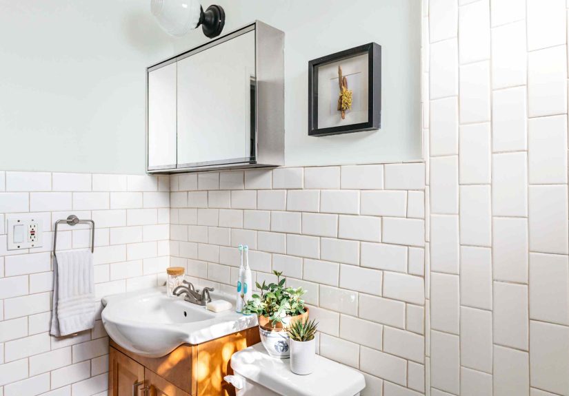
3) Stark White (and “All-White Everything”)
White will always have a place in bathroomsbut designers are increasingly pushing back on the ultra-bright, icy, stark version (especially when everything is white: walls, tile, ceiling, vanity, even the bath mat). Instead of “luxury hotel,” it can feel cold, one-note, and surprisingly unforgiving.
Why it reads dated
- Stark white can feel sterile under cool LEDs and reflect glare off tile and mirrors.
- In bathrooms without great lighting, it can look flat rather than crisp.
- All-white rooms often lack contrast, so they can feel unfinished instead of minimal.
Designer-approved swaps
Choose whites with warmth and undertone control: warm off-white, cream, or soft “linen” whites. These still read clean, but they’re friendlier to skin tones and more forgiving in dim bathrooms. Designers also love breaking up white with grounding accentsmatte black hardware, warm wood, camel tones, or stone elements that add depth.
Quick styling win: If you want that airy look, keep walls warm-white, then add contrast with one “anchor” elementlike a darker vanity, black faucet set, or a stone tile feature wall.
4) Muddy Greige, Dingy Beige, and “Indecisive Neutrals”
The 2010s loved greige. Builders loved it even more. But designers are now openly tired of bathroom neutrals that don’t commit to being warm, cool, light, or moodyjust… vaguely there. In a bathroom, muddy neutrals can make the space feel dim, dated, and less clean (even when it is clean, which feels rude).
Why it reads dated
- They can visually weigh down a small bathroom and steal brightness.
- Undertones can turn unpleasant next to tile (hello, surprise khaki or mauve).
- They often look like a “safe choice” rather than a designed choice.
Designer-approved swaps
If you want neutral, go clearer and more intentional: stone, warm taupe, soft putty, or a refined warm greige with depth. Or skip the halfway neutral and choose a true colordeep blue-green, sage, terracotta, or a cozy cocoa-brownthen balance it with light, classic finishes.
Quick styling win: Test your neutral next to your tile and under your actual bathroom bulbs. A color that looks “warm beige” in the store can look like “sad mushroom” at home.
5) Navy Blue (When It’s Overdone)
Navy is a classic. It’s also become a default. Designers often say navy bathrooms have reached “expected” status, especially when it’s the same predictable deep blue on the walls or vanity, paired with white subway tile and shiny chrome. It’s not offensiveit’s just not exciting anymore.
Why it reads dated
- It’s been used so widely that it can feel cookie-cutter.
- In certain bathrooms it reads heavy, especially if there’s limited natural light.
- Flat navy can look one-dimensional instead of rich.
Designer-approved swaps
Want the drama of navy without the predictability? Designers often suggest midnight teal, inky blue-green, denim blues, or even a smoky charcoal. These shades keep the depth, but add complexity, warmth, or a fresher undertone. They also play beautifully with brass, walnut, creamy whites, and natural stone.
Quick styling win: If you’re committed to blue, add dimension through finish and texture. Matte walls + satin trim + a little gleam from metal and mirror = depth without repainting in six months.
What Designers Are Choosing Instead
If you’re wondering what feels current right now, designers are leaning into bathrooms that feel warmer, more personal, and more dimensional. Rather than defaulting to icy neutrals, they’re using color to create moodeven in small spaces.
5 “fresh direction” palettes that keep showing up
- Warm off-whites (clean, but not clinical)
- Terracotta and clay (warmth without the heaviness of red-wine shades)
- Grassy greens and soft sages (nature-forward, flattering, versatile)
- Stone-inspired neutrals (intentional, calming, less muddy)
- Cocoa, espresso, and smoky browns (cozy, modern, surprisingly bathroom-friendly)
Translation: bathrooms are becoming less “blank canvas” and more “tiny jewel box.” And honestly, they deserve it. They put up with a lot.
Fast, Practical Tips to Avoid a Paint Regret Spiral
Sample like a realist
Put large samples on at least two walls and look at them morning, afternoon, and night. Bathrooms can flip a color faster than your face flips when the shower turns cold.
Think undertones, not just “light or dark”
Whites and neutrals are basically undertone delivery systems. Warm whites tend to feel softer and more welcoming; cool whites can feel crisp but may go icy in certain lighting.
Pick a finish that can handle humidity
Bathrooms need durability. Many pros prefer moisture-friendly finishes like satin or semi-gloss (especially in splash zones), so your gorgeous new color doesn’t become a science experiment.
Conclusion
“Outdated” doesn’t mean “never use it again.” It means: choose intentionally, and update the shade, undertone, or styling so your bathroom feels like a deliberate design choicenot a leftover trend. If your walls are currently bubblegum pink, seafoam green, stark white, muddy greige, or default navy, you’re not doomed. You’re just one paint weekend away from a bathroom that feels fresh, flattering, and very much in the year we’re living in.
Real-Life Experiences: What Actually Happens When People Repaint These “Outdated” Bathrooms (500+ Words)
Here’s the part nobody tells you when you’re staring at 43 paint swatches and questioning every decision you’ve ever made: bathroom paint isn’t just about tasteit’s about lived experience. And the “outdated” colors above tend to create the same real-world problems over and over again, no matter how pretty they looked in a filtered photo.
First, there’s the mirror moment. People repaint a bathroom because the color feels dated, yes but also because it feels unflattering. Seafoam green and certain muddy neutrals have a talent for casting odd undertones onto skin. You don’t notice it right away; then one morning you catch your reflection and think, “Do I look… slightly green?” or “Why do I look tired in HD?” It’s not you. It’s the paint bouncing around a small room full of reflective surfaces.
Second, there’s the lighting reality check. A lot of “outdated” shades are fine in soft daylight and brutal under cool LEDs. That’s why stark white bathrooms often go from “crisp and clean” to “dentist office” the second the sun goes down. When homeowners switch to warm off-whites, the most common reaction is basically: “Oh. This is what ‘calm’ feels like.” Warm whites don’t just look nicerthey reduce glare and make tile, stone, and metal finishes look more intentional.
Third, there’s the tile showdown. Bathrooms have fixed elements you usually aren’t changing: floor tile, shower tile, vanity top. Muddy greige and beige often lose because they’re undertone wildcards. Next to one tile, they look creamy. Next to another, they look greenish. Next to a warm wood vanity, they look like damp cardboard. When people swap to a clearer stone neutral or a true color (sage, terracotta, deep teal), the bathroom suddenly looks “designed”because the paint is no longer trying to be every neutral at once.
Fourth, there’s the trend fatigue factor. Navy blue is the best example. Plenty of people still love it, but many repaint because they’re boredbecause it’s everywhere, because it feels expected, because it reminds them of a dozen identical renos. The funny thing is: they don’t always want something brighter. Often, they just want something less default. Midnight teal, smoky blue-green, denim blues, and rich charcoals deliver the same depth without the “I’ve seen this exact bathroom on page two of Google Images” feeling.
Fifth, there’s the maintenance surprise. Some homeowners keep an all-white bathroom because they assume it’s “easy.” Then they realize white shows everything: scuffs, hair dye splashes, steam streaks, makeup fingerprints near the light switch. Once people add contrastwood tones, darker hardware, warmer whites, even a slightly deeper neutralthe bathroom still feels clean, but it stops looking like it’s constantly asking for a touch-up.
The biggest takeaway from all these repaint stories is simple: the best modern bathroom colors don’t just look good in a photo. They look good in real light, next to real tile, with real steam, while you’re doing real life at 7:12 a.m. Pick a color with depth, test it properly, choose a bathroom-friendly finish, and your walls will stop fighting your space. Your bathroom will feel newernot because it’s trendy, but because it finally feels intentional.