Table of Contents >> Show >> Hide
- What exactly is “Gentleman’s Cap Lime”?
- The design vibe: “controlled chaos”
- Why lime green works in modern interiors
- Botanical wallpaper isn’t a fadit’s a classic with better lighting
- How to use Lime without turning your room into a neon smoothie
- Budget-smart ways to get the look
- Where Gentleman’s Cap Lime shines: room-by-room ideas
- Styling playbook: color, materials, and “don’t over-accessorize”
- Scale and lighting: the two deal-breakers
- Wallpaper practicals: how to make it look professionally installed
- Common mistakes (and how to avoid them)
- Conclusion: a bold botanical that still feels tailored
- 500+ words of real-life experiences with Gentleman’s Cap Lime
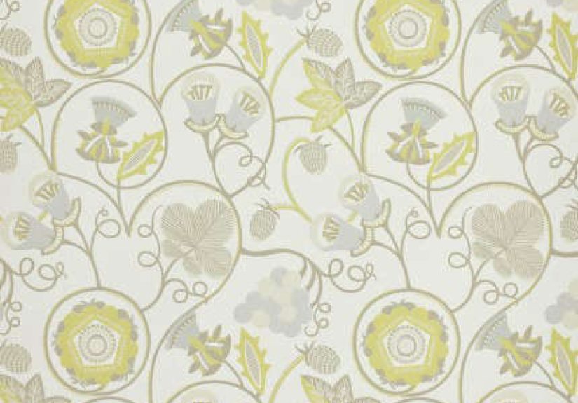
There are two kinds of people in the world: the ones who think “lime” means “fresh and subtle,” and the ones who have met actual lime. Gentleman’s Cap Lime is for the second groupbold, botanical, and just a little bit mischievous. It’s a wallpaper colorway from designer Neisha Crosland, known for patterns that feel like they were drawn by nature… then edited by someone with very sharp taste (and sharper scissors).
Below is a practical, design-forward guide to what it is, how to style it, and how to install it so it looks “custom home” instead of “I fought a paste bucket and lost.”
What exactly is “Gentleman’s Cap Lime”?
Gentleman’s Cap is the wallpaper design; Lime is the colorway. The pattern is described as “a rambling tangle of hedgerow undergrowth,” full of “playful, jostling movement”which is a very polite way of saying it looks alive, like vines are whispering secrets on your wall.
It’s commonly listed in a standard designer roll format (about 52 cm wide and 10 m long) with a repeat large enough to read as a true statement. Translation: this isn’t wallpaper that politely fades into the background. It’s wallpaper that makes eye contact.
The design vibe: “controlled chaos”
Botanical wallpaper works when it feels intentional, not accidental. Gentleman’s Cap hits the sweet spot because it’s busy without being noisy: lots of organic movement, but a clear rhythm that repeats predictably across the wall. You get the romance of a garden hedge and the order of a pattern booknature in a tailored suit.
Why lime green works in modern interiors
Green never really leaves home design; it just changes outfits. Lime is the extrovert cousin: energetic, bright, and surprisingly versatile when you use it with restraint elsewhere. Many editors and designers link the renewed love for botanicals to nature-forward, mood-boosting interiorsmore organic motifs, more texture, and more color that feels “alive,” not sterile.
One helpful mindset: treat lime like a great tie or a standout sneaker. It can carry the whole look, as long as everything around it is calm and well-fitted.
Quick clarification for the internet: “Gentleman’s Cap” is also the name of at least one cocktail on a Las Vegas menu. Delicious? Probably. Relevant to your wall? Only if you plan to serve bourbon while you hang wallpaper (not recommended for straight seams).
Botanical wallpaper isn’t a fadit’s a classic with better lighting
Design publications keep circling back to botanicals because they do two jobs at once: they add pattern and they add atmosphere. The best modern examples aren’t tiny “country cottage” sprigsthey’re larger, more illustrative prints that feel like art. You’ll see designers using botanical wallcoverings in hardworking spaces like mudrooms and hallways, where a little visual joy makes daily routines feel less… routine. The trick is pairing that organic pattern with clean lines and contemporary materials so the result feels intentional, not themed.
How to use Lime without turning your room into a neon smoothie
If you’re nervous about lime, you’re not alone. Here are three designer-approved “safety rails” that keep the color feeling sophisticated:
- Keep the trim crisp. Bright white or a soft warm white trim gives the pattern a tailored edge.
- Choose one supporting metal. Brass or black, not a sampler pack of finishes.
- Let one neutral dominate. Think creamy walls on adjacent surfaces, pale stone, or warm woodso lime reads like an accent, even when it’s on the wall.
Also, a fun color fact that helps reset expectations: authentic Key lime pie isn’t neon green; it’s usually more yellow from egg yolks. Lime is often added for effect. Same lesson herelime looks best when it’s the deliberate highlight, not the only thing happening.
Budget-smart ways to get the look
- Full-room wrap: ideal for powder rooms and entries where drama is the whole point.
- One statement wall: perfect for bedrooms and officeshigh impact, lower cost.
- Framed panels: install the wallpaper inside molding frames like oversized art for a more “custom” look.
- Peel-and-stick trials: great for rentals or commitment-phobes; take your time aligning panels because removable doesn’t mean forgiving.
Where Gentleman’s Cap Lime shines: room-by-room ideas
Powder rooms and small bathrooms
If you want maximum impact with minimum square footage, start here. Small rooms can handle bolder wallcoverings because there’s less of it to process at once. The key is moisture management: ventilate well, prime properly, and keep wallpaper away from direct shower spray so edges don’t lift when your bathroom turns into a steam room.
Entryways and hallways
Hallways are transitional spacesperfect for drama. A lime botanical in the entry says, “Welcome; yes, I have opinions.” Keep the rest simple: one strong runner, a mirror, and lighting that doesn’t compete.
Dining nooks and breakfast corners
Botanicals belong near food. That’s not science; it’s just emotionally correct. Lime feels bright and appetizing, and it plays beautifully with warm woods and brass. In open-plan spaces, use it on one wall to create a “room within a room.”
Home offices and creative studios
Need energy without chaos? This is the move. Put it behind your desk so it reads as a confident backdrop on video calls, then keep the desktop and storage mostly neutral so your brain doesn’t start multitasking for sport.
Bedrooms (yes, really)
Instead of wrapping all four walls, try a single wall behind the headboard. Pull a quieter green from the wallpaper into bedding or drapery, and let the lime stay the star.
Styling playbook: color, materials, and “don’t over-accessorize”
Color pairings that make lime look expensive
- Black + white: crisp contrast; lime becomes graphic and modern.
- Warm neutrals (cream, sand, camel): grounded and grown-up.
- Deep blue (navy, ink): instantly more sophisticated.
- Soft pink (blush, dusty rose): playful, surprisingly chic.
Materials that keep it from feeling “highlighter”
Lime is a spotlightit highlights what’s around it. Pair it with real textures and it looks intentional:
- Warm wood (oak, walnut) for calm contrast.
- Aged metals (brass, bronze) for glow.
- Natural fibers (linen, rattan, cane) to echo the botanical vibe.
Art and furniture strategy
With a busy pattern, fewer and larger pieces read cleaner than lots of small items. Think simple black frames, generous mats, and art that either (1) has breathing room or (2) intentionally ties into the palette. Furniture should be the solid shapes: clean-lined seating, a simple console, a pedestal table. Let the wallpaper be the movement; let the furniture be the structure.
Scale and lighting: the two deal-breakers
Lime wallpaper changes personalities depending on light. In bright daylight, it reads crisp and garden-fresh. Under very warm bulbs, it can lean chartreuse and feel moodier. Order a sample, tape it up, and check it morning, afternoon, and nighttime. If it still makes you happy at 10 p.m., it’s a keeper.
Wallpaper practicals: how to make it look professionally installed
1) Measure like a grown-up
Measure wall width and height, then account for pattern repeat and matching. Large botanicals create waste because you’re aligning the design, not just covering area. The goal is to run out of wallpaper after you finish the room, not halfway through the best wall.
2) Prep the wall (this is where “pro” happens)
Wallpaper is honest: it will show bumps, loose paint, and grime. Start with a surface that’s clean, dry, and smooth. Patch and sand imperfections, then use wallpaper primer so the paper adheres properly and future removal is less dramatic. Remove outlet plates and protect sockets.
3) Hang it straight, not hopeful
Pros use a plumb line or laser level because corners aren’t always square. Start from a straight reference line, plan seam locations, and smooth from the center outward to push air bubbles away. A seam roller helps, but gentle pressure is the pointdon’t squeeze paste out like toothpaste.
4) Bathrooms: follow the humidity rules
If you’re using wallpaper in a bathroom, ventilation is non-negotiable. Consider mold-resistant primer and paste, and keep the paper away from direct water contact. Your wallpaper can be botanical, but it shouldn’t be amphibious.
5) Cleaning and quick fixes
Some wallpapers are washable; some prefer admiration from a respectful distance. For washable types, a soft sponge with mild dish soap and warm water can handle smudges. For delicate surfaces, use a vacuum with a soft brush attachment. If an edge starts to peel, fix it earlylifting corners spread faster than gossip.
Common mistakes (and how to avoid them)
- Skipping primer: primer improves adhesion and makes future removal safer.
- Wallpapering over uncured paint: freshly painted walls need time to cure before paper goes on.
- Clutter on top of pattern: keep accessories minimal so the wallpaper reads intentional.
- Bad bulb choice: if the color feels too intense at night, try a more neutral white bulb or a dimmer.
Conclusion: a bold botanical that still feels tailored
Gentleman’s Cap Lime is what happens when botanical wallpaper grows up and gets a great haircut. It’s energetic without being chaotic, playful without being childish, and bold without turning your room into a neon smoothie bar. If you like interiors with personalityand you’re willing to let your walls do some of the talkingthis is a pattern worth considering.
500+ words of real-life experiences with Gentleman’s Cap Lime
1) The “wow, this is brighter than the sample” moment. People who choose lime wallpaper often have a first-night reaction: the room looks different after sunset. In daylight, the color reads crisp and garden-fresh. Under warm evening lamps, it can deepen into a chartreuse glow. The experienced move is to test lighting before committingswap bulbs, add a dimmer, or introduce a second light source so the wallpaper doesn’t do all the emotional heavy lifting.
2) The dinner party effect. In dining spaces, a busy botanical background has a funny side benefit: it makes a simple table look styled. Homeowners often notice that even “weekday” meals feel a bit more special because the room has built-in atmosphere. The pattern becomes a conversation starter, tooguests will ask where it’s from, whether it’s hand-drawn, and why their own walls suddenly feel like they’re underachieving.
3) The DIY installation saga. Anyone who hangs a large-repeat wallpaper learns two lessons fast: seams are humbling, and patience is a superpower. A common experience is starting confident, then realizing the second strip needs perfect alignment or the vines look like they’re teleporting. The fix is slow, methodical workcut with extra length, line up the pattern at eye level, smooth gently, and resist the urge to “force” a match. People who take breaks (yes, on purpose) tend to get cleaner results than the ones who power through on sheer stubbornness.
4) The “I need to edit the rest of the room” ripple. A bold wallpaper raises the standard for everything else nearby. People often end up replacing a too-small rug, upgrading hardware, or swapping art frames because the walls made the old stuff look tired. The upside is that a few strategic updatesbetter lampshades, warmer metals, more natural texturescan make the whole space feel curated without a full renovation.
5) The long-term mood boost. Bright greens can feel daring at first, but many homeowners describe the novelty turning into a steady lift. It’s the same reason plants make a room feel alive: green signals freshness and energy. Gentleman’s Cap Lime adds that feeling even when it’s rainy outside and your houseplants are threatening to quit. The secret is letting the wallpaper be the hero while the rest of the palette stays calmthen the lime reads joyful, not chaotic.
6) The “camera loves it” surprise. Patterned walls can be tricky on video calls, but a medium-scale botanical often reads better than you’d expect. From a few feet back, the tangle turns into textureinteresting, not distractingespecially if your desk chair and shelves are simple. People who work from home frequently notice that clients remember the room (“the one with the green vines”) in a good way. The practical tip: keep the wall behind your head clear of tiny frames and clutter so the wallpaper can act like a clean backdrop. If your webcam starts doing weird moiré patterns, shift your angle slightly or add a softer, diffused light so the camera doesn’t over-sharpen the details.