Table of Contents >> Show >> Hide
- What Is a Gradient in GIMP?
- Before You Start: Set Up Your GIMP Workspace
- Step 1: Choose the Gradient Tool
- Step 2: Pick Your Foreground and Background Colors
- Step 3: Select a Gradient Preset
- Step 4: Choose the Gradient Shape
- Step 5: Drag Across the Canvas
- Step 6: Edit the Gradient on the Canvas
- How to Create a Custom Gradient in GIMP
- How to Make a Transparent Gradient
- How to Apply a Gradient to a Selection
- How to Use Gradients with Text
- Understanding Repeat, Offset, and Reverse
- Choosing the Right Blend Color Space
- Common Gradient Problems and How to Fix Them
- Best Practices for Better Gradients in GIMP
- Practical Example: Create a Soft YouTube Thumbnail Background
- Practical Example: Fade Two Photos Together
- Practical Example: Add a Vignette with a Radial Gradient
- Extra Experience: What I Learned from Working with Gradients in GIMP
- Conclusion
Creating a gradient in GIMP sounds simple: pick two colors, drag a line, admire your masterpiece, and pretend you planned the whole thing. But if you have ever opened GIMP, clicked the Gradient tool, and wondered why your canvas suddenly looks like a moody sunset, a shiny button, or a radioactive jellybean, you are not alone. Gradients are powerful, flexible, and just mysterious enough to make beginners suspicious.
The good news? Learning how to create a gradient in GIMP is easier than it looks. Whether you want a smooth background, a fading photo effect, a soft color overlay, a glossy web button, or a custom multi-color design, GIMP gives you everything you need without charging you a monthly fee for the privilege of moving pixels around.
In this step-by-step guide, you will learn how to use the GIMP Gradient tool, choose colors, apply different gradient shapes, edit gradient stops, create custom gradients, use gradients with selections and layer masks, and fix the most common beginner mistakes. By the end, you will not merely “use a gradient.” You will understand what makes gradients behave the way they do, which is the difference between design confidence and repeatedly clicking Undo while whispering, “What just happened?”
What Is a Gradient in GIMP?
A gradient is a smooth transition between colors. The simplest version fades from one color to another, such as blue to white, black to transparent, or orange to pink. More advanced gradients can include several colors, transparency, hard edges, repeating patterns, radial shapes, spiral effects, and custom color stops.
In GIMP, gradients are often used for:
- Website and social media backgrounds
- Photo overlays and lighting effects
- Text effects and typography designs
- Buttons, banners, icons, and thumbnails
- Layer masks for smooth image blending
- Color grading with Gradient Map
- Digital painting and illustration textures
The Gradient tool in GIMP fills an area with a color transition based on the gradient you choose and the direction you drag. In older tutorials, you may see this tool called the Blend Tool, but in modern GIMP versions it is commonly referred to as the Gradient tool.
Before You Start: Set Up Your GIMP Workspace
Before creating your first gradient, open GIMP and create a new file. Go to File > New, choose a canvas size, and click OK. For practice, a canvas around 1600 x 900 pixels works well because it gives you enough space to see the gradient clearly without needing a telescope or a wall-sized monitor.
Next, make sure the Tool Options panel is visible. If it is missing, go to Windows > Dockable Dialogs > Tool Options. This panel is important because it lets you change the gradient type, shape, opacity, repeat behavior, color space, and other settings.
Step 1: Choose the Gradient Tool
There are three easy ways to activate the Gradient tool in GIMP:
- Click the Gradient tool icon in the toolbox.
- Go to Tools > Paint Tools > Gradient.
- Press the keyboard shortcut G.
Once selected, your cursor is ready to draw a gradient line across the canvas. That line controls where the gradient starts, where it ends, and how soft or sharp the transition appears.
Step 2: Pick Your Foreground and Background Colors
The default gradient often uses your foreground and background colors. You can change these colors in the toolbox by clicking the overlapping color squares. The top square is the foreground color, and the bottom square is the background color.
For a simple test, choose a dark blue foreground and a light cyan background. This creates a clean sky-like gradient. For a more dramatic effect, try purple to orange. For a soft modern website background, use pale lavender to warm cream. For a classic fade, use black to transparent or black to white.
The key is to choose colors that have a purpose. A gradient should guide the eye, create depth, or support the design. Random neon green fading into emergency-siren red may be memorable, but not always in the “hire this designer immediately” way.
Step 3: Select a Gradient Preset
In the Tool Options panel, look for the Gradient preview. Click it to open the gradient selection list. GIMP includes many built-in gradients, including foreground-to-background options, colorful presets, transparency-based gradients, and artistic color blends.
For beginners, the most useful presets are:
- FG to BG (RGB): A standard fade from the foreground color to the background color.
- FG to Transparent: A fade from the foreground color into transparency.
- FG to BG (HSV): A hue-based transition that may produce more colorful shifts.
- Built-in artistic gradients: Useful for experiments, textures, and bold effects.
If you are designing a clean background, start with FG to BG (RGB). If you are fading an image or adding a soft shadow, FG to Transparent is often the better choice.
Step 4: Choose the Gradient Shape
GIMP offers several gradient shapes, and each one changes how the color transition spreads across the image. The shape setting is one of the most important options because it controls the overall look of the gradient.
Linear Gradient
A linear gradient moves in a straight line from one color to another. This is the most common type and is perfect for backgrounds, banners, and subtle lighting.
Radial Gradient
A radial gradient spreads outward from a center point in a circular pattern. Use it to create spotlight effects, glows, soft vignettes, and round highlights.
Bi-Linear Gradient
A bi-linear gradient extends in two opposite directions from the starting point. It can help create cylinder-like shading, metallic effects, and symmetrical lighting.
Square and Shaped Gradients
Square and shaped gradients are useful when you want the gradient to respond to a selection or create more geometric transitions. These can look unusual at first, but they are great for experimental graphics and icon design.
Conical and Spiral Gradients
Conical gradients create a cone-like sweep around a point, while spiral gradients produce rotating, swirl-like transitions. They are not used in every design, but when you need a dramatic effect, they show up wearing sunglasses.
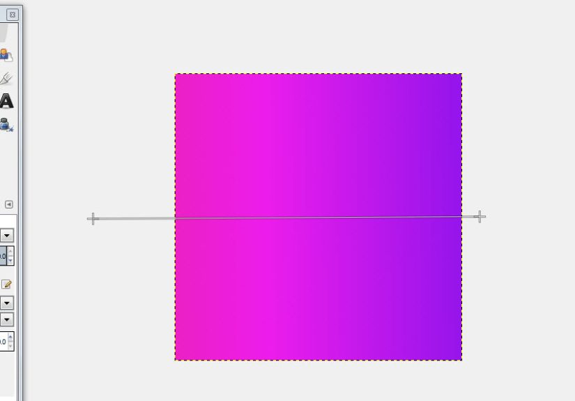
Step 5: Drag Across the Canvas
Now comes the satisfying part. Click on the canvas where you want the gradient to begin, drag in the direction you want the gradient to flow, and release where you want it to end.
The length of your drag matters. A short drag creates a sharp transition, while a long drag creates a softer, smoother transition. If you drag from the top of the canvas to the bottom, the gradient moves vertically. If you drag from left to right, it moves horizontally. Drag diagonally for a diagonal gradient.
For example, to create a simple website hero background, choose a navy foreground color and a pale blue background color. Select Linear, then drag from the upper left corner to the lower right corner. The result is a smooth diagonal fade that feels more dynamic than a flat color.
Step 6: Edit the Gradient on the Canvas
Modern GIMP allows on-canvas gradient editing. After drawing the gradient, you can adjust endpoints, move color stops, add new stops, and modify transitions directly on the image. This is incredibly useful because you can see changes in real time instead of guessing from a hidden settings menu like you are decoding a treasure map.
To edit the gradient, hover over the gradient line. You may see endpoints, midpoints, or small handles. Drag the endpoints to change the direction and length. Move stops to change where colors appear. Add new stops if you want more than two colors in your gradient.
For a sunset-style background, you could create a gradient with deep purple at the top, pink in the middle, and orange near the bottom. Add a color stop around the center, set it to pink, and adjust the midpoint until the blend looks natural.
How to Create a Custom Gradient in GIMP
Built-in gradients are useful, but custom gradients give you full creative control. To create one, open the Gradients dialog. You can access it from the dockable dialogs menu or by clicking the gradient preview area.
In the Gradients dialog, choose the option to create a new gradient. GIMP will open the Gradient Editor, where you can name your gradient and adjust its segments. A gradient segment is the space between two color points. You can set the left and right colors, move midpoints, split segments, and build a multi-color transition.
One important detail: GIMP generally does not let you directly edit system gradients that come pre-installed. Instead, create a new gradient or duplicate an existing one, then edit the copy. This keeps the original presets safe, which is nice because nobody wants to accidentally ruin a default gradient and spend the afternoon blaming the software.
How to Make a Transparent Gradient
A transparent gradient is one of the most practical effects in GIMP. It lets you fade an object, blend two images, soften an edge, or create a gentle overlay.
To create a transparent gradient:
- Select the layer you want to fade.
- Make sure the layer has transparency. If needed, right-click the layer and choose Add Alpha Channel.
- Select the Gradient tool.
- Choose FG to Transparent as the gradient.
- Set your foreground color.
- Drag across the image where you want the fade to appear.
For non-destructive editing, use a layer mask instead of applying transparency directly to the layer. Add a white layer mask, select the mask thumbnail, choose a black-to-white gradient, and drag across the image. Black hides, white reveals, and gray creates partial transparency. It is one of the most useful tricks in GIMP, especially for blending photos together.
How to Apply a Gradient to a Selection
Sometimes you do not want the gradient to cover the entire canvas. Maybe you only want it inside a circle, a rectangle, a text shape, or a cut-out object. In that case, create a selection first.
Use the Rectangle Select, Ellipse Select, Free Select, or Fuzzy Select tool to define an area. Then select the Gradient tool and drag inside the selected area. GIMP will apply the gradient only within the active selection.
This is perfect for creating buttons. Make a rounded rectangle selection, choose a light-to-dark vertical gradient, and drag from top to bottom. The lighter top and darker bottom create a subtle 3D effect. Add a small highlight line near the top, and suddenly your button looks like it belongs in a polished interface instead of a forgotten 2007 forum signature.
How to Use Gradients with Text
Gradients can make text look more colorful, dimensional, and eye-catching. The basic method is to create text, convert it to a selection or keep it as a layer, and then apply the gradient.
Here is a simple way:
- Create your text with the Text tool.
- Right-click the text layer and choose Alpha to Selection.
- Create a new transparent layer above or use the selected text layer carefully.
- Select the Gradient tool.
- Choose your gradient colors.
- Drag across the selected text.
For a clean headline effect, try a dark blue to bright cyan gradient. For a bold poster style, try yellow to orange or magenta to purple. Keep readability in mind. If the gradient makes the text harder to read, it is not decoration anymore; it is camouflage.
Understanding Repeat, Offset, and Reverse
The Gradient tool includes options that can change the final effect dramatically.
Reverse
The Reverse option flips the gradient direction. If your gradient is fading from blue to white and you want white to blue, click Reverse instead of changing both colors manually.
Repeat
Repeat controls what happens beyond the endpoints of the gradient. Options such as sawtooth and triangular wave can create repeated color bands or mirrored transitions. These are useful for patterns, abstract art, and texture experiments.
Offset
Offset shifts where the gradient begins. This can make the transition appear tighter or pushed away from the starting point. It is useful when the gradient is technically correct but visually starts too early.
Choosing the Right Blend Color Space
GIMP includes color space options that affect how colors blend. For most everyday work, the default setting is fine. However, if your gradient looks muddy, overly gray, or visually uneven, try changing the blend color space.
Perceptual RGB is a common default and works well for general design. Linear RGB can be useful when you want blends that behave more like physical light. CIE Lab may produce smoother perceptual transitions for certain color combinations. You do not need to become a color scientist to use these settings, but experimenting with them can rescue a gradient that looks “almost right” but not quite polished.
Common Gradient Problems and How to Fix Them
The Gradient Covers the Whole Canvas
If you only wanted the gradient in one area, make a selection first or apply the gradient to a separate layer. Working on separate layers gives you more control and prevents permanent changes to the original image.
The Gradient Looks Too Harsh
Drag a longer line. Short gradient lines create sharper transitions. You can also use softer colors or adjust the midpoint between color stops.
The Colors Are Backward
Use the Reverse option, swap your foreground and background colors, or drag in the opposite direction.
The Gradient Does Not Appear
Check that the correct layer is selected, the layer is visible, opacity is not set to zero, and there is no tiny active selection hiding somewhere on the canvas. In GIMP, invisible selections are the design equivalent of stepping on a Lego in the dark.
The Gradient Has Banding
Banding happens when a smooth gradient shows visible stripes. Try enabling dithering, using a higher bit-depth image, avoiding extreme color compression, or adding a very subtle noise layer to break up the bands.
Best Practices for Better Gradients in GIMP
Great gradients usually look effortless, but they are rarely random. Use them with intention. A gradient should support the message of the design, not fight for attention like a toddler with a tambourine.
Keep transitions subtle for professional backgrounds. Use strong gradients for posters, thumbnails, gaming graphics, and expressive artwork. Match the gradient direction to the light source in your design. If the highlight is at the top left, the gradient should usually support that direction. When blending images, use layer masks so you can adjust the fade later.
Also, remember that gradients are more effective when paired with good contrast. If you place text over a gradient, check readability at different screen sizes. A beautiful gradient that makes text unreadable is not a design choice; it is a tiny usability disaster wearing nice colors.
Practical Example: Create a Soft YouTube Thumbnail Background
Let us create a simple background for a YouTube thumbnail or blog image.
- Create a new 1280 x 720 image.
- Set the foreground color to dark purple.
- Set the background color to bright pink or orange.
- Select the Gradient tool.
- Choose FG to BG (RGB).
- Set the shape to Linear.
- Drag diagonally from the top left to the bottom right.
- Create a new transparent layer.
- Use a radial gradient with white to transparent for a soft glow behind your subject or text.
- Lower the glow layer opacity until it looks natural.
This creates depth while leaving enough contrast for text. Add a subject cutout, a bold headline, and maybe a subtle shadow. Congratulations: your thumbnail now has more visual energy than a plain background, but it has not crossed into “graphic design fireworks accident.”
Practical Example: Fade Two Photos Together
Gradients are excellent for blending two photos. Place one image on a layer above another. Add a white layer mask to the top image. Select the mask, choose a black-to-white linear gradient, and drag from the area you want hidden toward the area you want visible.
The black part of the mask hides the top image, the white part reveals it, and the gray area creates a smooth transition. This technique is ideal for collages, double exposure effects, before-and-after graphics, and artistic composites.
Practical Example: Add a Vignette with a Radial Gradient
A vignette darkens the edges of an image to draw attention toward the center. To create one in GIMP, add a new transparent layer above your photo. Choose black as the foreground color and select FG to Transparent. Set the gradient shape to Radial, use Reverse if needed, and drag from the center outward or from the edges depending on your setup.
Then lower the layer opacity until the effect feels natural. A good vignette should guide the eye without shouting, “Hello, I am a vignette.” Subtlety wins.
Extra Experience: What I Learned from Working with Gradients in GIMP
The biggest lesson from creating gradients in GIMP is that the first result is rarely the final result. A gradient is not just a fill; it is a design decision. The angle, length, color choice, opacity, layer mode, and shape all affect the mood of the finished image. A small change in drag direction can turn a flat background into something that feels polished and intentional.
One useful habit is to create gradients on separate layers whenever possible. This gives you room to experiment without damaging your original artwork. You can lower opacity, change layer modes, erase parts, add masks, blur the gradient, or duplicate it for stronger effects. When you work directly on the original layer, every mistake feels dramatic. When you work on a separate layer, mistakes become options.
Another practical experience is that simple color combinations often look better than complicated ones. Beginners sometimes want to use five bright colors because GIMP allows it. Technically, yes, you can create a rainbow gradient with enough intensity to wake your neighbors. But for professional designs, two or three carefully chosen colors usually look cleaner. A deep navy fading into soft blue, a warm beige fading into cream, or a dark purple fading into pink can look more expensive than a chaotic mix of every color in the digital crayon box.
Layer masks are also worth learning early. A black-to-white gradient on a layer mask can blend photos, fade edges, soften shadows, and create natural transitions. It is one of those skills that seems minor at first and then quietly becomes part of almost every serious GIMP workflow. If you are editing product photos, creating thumbnails, designing banners, or making digital art, gradient masks can save enormous time.
It also helps to zoom out often. A gradient may look perfect at 200 percent zoom, but too harsh when viewed at normal size. The opposite can happen too: a subtle background gradient may disappear when exported and compressed. Before finishing, view the image at the size your audience will actually see it. A website banner, phone screen, and print layout all reveal gradients differently.
Finally, do not ignore banding. Banding can make an otherwise smooth gradient look cheap. If you notice stripes in a gradient, try enabling dithering, working at higher quality, choosing colors with less extreme contrast, or adding a very faint noise texture. The goal is not to make the noise visible; the goal is to break up the harsh steps so the transition feels smoother.
In real projects, gradients are best used as quiet helpers. They add light, depth, movement, and atmosphere. They can make a flat design feel alive, but they should not steal the whole show unless the gradient itself is the artwork. Treat gradients like seasoning: enough makes the dish better, too much makes everyone suspicious.
Conclusion
Learning how to create a gradient in GIMP gives you a flexible design skill that works across photo editing, digital art, web graphics, social media visuals, and professional layouts. Start with the Gradient tool, choose your foreground and background colors, select a shape, drag across the canvas, and adjust the result until it fits your design.
Once you understand the basics, explore custom gradients, transparent fades, layer masks, radial glows, text effects, and Gradient Map color styling. The more you experiment, the more natural gradients become. And when a gradient goes wrong, do not panic. It is usually just a setting, selection, layer, or drag distance waiting to be corrected.
GIMP gives you serious control over gradients without making you pay for a subscription or sacrifice your creative freedom. With a little practice, you can create smooth backgrounds, polished photo blends, dramatic lighting, and custom effects that look intentional instead of accidental. That is the real magic of gradients: they make simple designs feel deeper, softer, and more alive.