Table of Contents >> Show >> Hide
- Before We Begin: What “Vector” Means in Photoshop
- Method 1: Create Vector Images from Scratch with Shape Layers + Pen Tool
- Step 1: Set Up a Clean Canvas
- Step 2: Use Shape Tools in Shape Mode
- Step 3: Build Complex Forms with Path Operations
- Step 4: Switch to the Pen Tool for Precision
- Step 5: Refine with Direct Selection + Convert Point
- Step 6: Keep It Vector-Clean
- Step 7: Export for Real-World Use
- Example Workflow: Coffee Shop Logo Icon
- Method 2: Convert a Raster Image to Vector Paths in Photoshop
- Best Practices for SEO-Friendly Vector Graphics on the Web
- Common Mistakes (and Quick Fixes)
- Real-World Experience: from the Design Trenches
- Conclusion
Let’s start with the truth everyone whispers but rarely says out loud: Photoshop is famous for pixels, not pure vector wizardry.
But here’s the fun partyou can absolutely create crisp, scalable vector graphics in Photoshop when you use the right tools and workflow.
If you’ve ever zoomed into your logo and watched it turn into blurry cereal, this guide is your redemption arc.
In this tutorial, you’ll learn two practical methods:
(1) building vectors from scratch using Shape layers + Pen tool, and
(2) converting a raster image into editable vector paths for logos, icons, and simple illustrations.
Along the way, we’ll cover anchor points, Bézier curves, “Make Work Path,” SVG export, and how to avoid the mistakes that make designers stare at the screen like it owes them rent.
Before We Begin: What “Vector” Means in Photoshop
A vector image is made from mathematical paths, not fixed pixels. That means it scales cleanly for everything from app icons to billboard signs.
In Photoshop, vector content lives mainly in Shape layers, paths, and vector masks.
So yes, Photoshop can produce vector-friendly assetsespecially if your design is geometric, logo-based, icon-driven, or flat illustration style.
When Photoshop Works Great for Vector Tasks
- Simple logos and marks
- Icons and UI shapes
- Badges, stickers, labels
- Social graphics with clean lines
- Layered comps mixing photo + vector accents
When You May Want Illustrator Instead
- Complex illustration with many paths and live effects
- Advanced typography systems
- Heavy-duty print production and prepress workflows
- Automated tracing at high fidelity
Think of Photoshop as: “vector-capable with caveats.” If you stay inside those boundaries, you’ll get sharp, scalable work without leaving your favorite interface.
Method 1: Create Vector Images from Scratch with Shape Layers + Pen Tool
This is the cleanest method and the one pros use for custom logos, icons, and flat graphics.
You’re not converting anythingyou’re building vector geometry directly.
Step 1: Set Up a Clean Canvas
Create a new document sized for your intended use (for example, 2000 × 2000 px gives plenty of room).
Turn on guides and grid if needed. Name layers early. “Shape 27 copy 4 final FINAL” is a cry for help, not a workflow.
Step 2: Use Shape Tools in Shape Mode
Select a shape tool (Rectangle, Ellipse, Polygon, Line, or Custom Shape).
In the options bar, set mode to Shape (not Pixels).
This creates a vector shape layer automatically.
- Hold Shift for perfect circles/squares.
- Set Fill and Stroke thoughtfully (flat colors are usually easiest for scalable assets).
- Use separate layers for each major component at first.
Step 3: Build Complex Forms with Path Operations
Combine primitives into custom designs:
Combine, Subtract Front Shape, Intersect, and Exclude Overlapping.
This is where your icon goes from “basic geometry homework” to “actual brand asset.”
Step 4: Switch to the Pen Tool for Precision
The Pen tool is your precision blade. Use it to draw custom curves, corners, and silhouettes.
Click for straight segments, click-drag for curves, and keep anchor points as minimal as possible.
Fewer points = cleaner paths = easier edits = fewer 2 a.m. regrets.
Step 5: Refine with Direct Selection + Convert Point
After roughing in the path, refine:
- Direct Selection Tool (A) to move individual anchor points.
- Convert Point Tool to change corner points to smooth points (and back).
- Adjust Bézier handles for smoother curves and better symmetry.
Step 6: Keep It Vector-Clean
If your final goal is an SVG or scalable brand mark, avoid effects that force raster rendering (heavy blur stacks, certain filters, photo textures).
Stick to clean fills, strokes, and path structure.
You can always add raster flair later in alternate outputs.
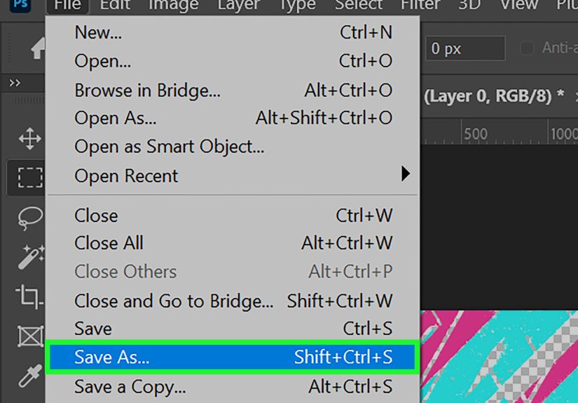
Step 7: Export for Real-World Use
Save a master PSD first. Then export:
- SVG for web and UI
- PDF for cross-app sharing
- PNG (high-resolution fallback) for platforms that need raster delivery
If your layer stack is vector-based, export quality stays crisp and scalable.
Example Workflow: Coffee Shop Logo Icon
Build a mug with rounded rectangle + ellipse, subtract a half-circle for the handle opening, draw steam with Pen curves, unify stroke style, then export SVG.
Total time: about 15–30 minutes once you’re comfortable.
Client reaction: “Wow, that’s clean.”
Your reaction: “Yes. Yes it is.”
Method 2: Convert a Raster Image to Vector Paths in Photoshop
This method is perfect when you have a low-res logo, a scanned doodle, or a flat graphic and need a scalable version.
Important note: Photoshop can do this for simple designs, but it is not a full auto-tracing powerhouse.
The cleaner the source image, the better the result.
Step 1: Start with the Right Image
Best candidates:
- High-contrast logos (dark shape on light background)
- Simple icons with clear edges
- Line art with minimal texture
Worst candidates: noisy photos with soft gradients and hair-like detail everywhere.
You can still try, but expect cleanup.
Step 2: Simplify the Image
Duplicate your layer. Increase contrast or add a Threshold adjustment layer to separate subject and background.
You’re preparing the art for path conversion by reducing visual complexity.
Step 3: Make a Selection
Use one of these:
- Select Subject (good for obvious objects)
- Magic Wand (good for flat colors)
- Color Range (great for isolating specific tones)
Step 4: Convert Selection to Path
Open the Paths panel and choose Make Work Path.
Set tolerance carefully:
- Lower tolerance = more anchor points, closer edge match
- Higher tolerance = smoother/simpler path, less detail
Start around 1.0–2.0 and adjust based on complexity.
For sharp logo edges, go lower and clean manually.
Step 5: Clean the Path Manually
Auto-generated paths are a draft, not a final.
Use Direct Selection and Pen tools to:
- Delete unnecessary points
- Straighten crooked segments
- Smooth awkward curves
- Close open path fragments
Step 6: Create a Shape Layer from the Path
Once the path looks clean, convert it to a shape/fill layer.
Apply brand color, inspect at multiple zoom levels, and verify edge quality.
If it looks good at 100%, 400%, and 1000%, you’re in business.
Step 7: Export SVG (or Hand Off to Illustrator if Needed)
For simple assets, Photoshop export is often enough.
For complex traces with dozens of nested paths, consider finishing in Illustrator after roughing the shape in Photoshop.
Hybrid workflow = speed + precision.
Best Practices for SEO-Friendly Vector Graphics on the Web
Since this content is for web publishing, here’s the practical SEO angle:
- Use descriptive filenames (e.g., coffee-shop-logo-vector.svg)
- Add relevant alt text for context and accessibility
- Prefer SVG for logos/icons and line-art graphics
- Keep code/paths clean to avoid bloated file size
- Use PNG/WebP fallback when platform limitations exist
Clean vector assets improve visual quality across screen sizes and can help with performance when used appropriately.
Better UX often leads to better engagement signals. That matters for both users and search engines.
Common Mistakes (and Quick Fixes)
Mistake 1: Drawing in Pixels Mode by Accident
Fix: Always check tool mode before drawing. If you need scalable output, use Shape/Path mode.
Mistake 2: Too Many Anchor Points
Fix: Simplify paths. Remove extra points and smooth handles.
Clean geometry beats point chaos.
Mistake 3: Tracing a Busy Photo and Expecting Logo-Level Results
Fix: Pre-simplify with Threshold/contrast and accept manual refinement.
Or move to Illustrator for advanced tracing.
Mistake 4: Forgetting Export Requirements
Fix: Ask where the graphic will live (web, print, app, social, signage) before final export.
One size rarely fits all deliverables.
Real-World Experience: from the Design Trenches
I’ve used these two methods in real production situations more times than I can count, and the biggest lesson is this: the “right” method depends less on software loyalty and more on the shape complexity of your final deliverable.
When a client sends a blurry logo in a screenshot pulled from a decade-old PDF, panic is optional. Process is not.
I start by checking whether the logo is geometric or organic. If it’s geometricthink circles, straight edges, simple curvesI go straight to Method 1 and rebuild it from scratch with shape layers.
Rebuilding is often faster than trying to rescue a messy trace. You get cleaner points, lighter files, and way fewer surprises in export.
One retail client needed 47 icons for packaging, web banners, and a mobile app.
Their original files were inconsistent: some PNG, some JPG, some mystery files with names like “icon-new-final-use-this-one2.png.”
We standardized everything in Photoshop using shape layers and Pen paths.
The first day felt slow because we were setting standardsstroke width rules, corner radius, grid spacing, naming conventions.
By day three, production speed doubled.
Why? Because vector consistency compounds.
If every icon shares the same visual grammar, editing one teaches you how to edit all.
We exported SVG for web and high-res PNG fallbacks for marketplaces that still reject SVG uploads.
The result was a cleaner storefront, faster load behavior on icon-heavy sections, and fewer support tickets saying, “Why does this badge look blurry on my tablet?”
Method 2 shines when time is tight and perfection is not the immediate requirement.
I once had to recreate a sponsor mark from a photo of a printed banneryes, a photo of a banner, shot at an angle, under bad lighting.
Glamorous? No. Real life? Absolutely.
We corrected perspective, pushed contrast, isolated the mark, made a work path, then manually cleaned anchors.
The first auto path was uglytoo many points, lumpy curves, and corners that looked like they had trust issues.
But after 25 minutes of manual refinement, it became fully usable.
Not museum-grade vector art, but clean enough for event signage, social assets, and press kits.
Another practical insight: junior designers often over-edit curves.
They tug handles until paths become mathematically dramatic but visually weird.
My rule is simple: zoom out often.
If your curve only looks “perfect” at 800% and strange at normal viewing size, it is not perfect.
Good vector work is humble: controlled points, predictable shape language, and export-ready structure.
Fancy complexity is not a badge of skill; clarity is.
Finally, file hygiene matters more than people think.
Name layers intentionally, group logical components, and keep a master PSD untouched before exporting variants.
Your future selfor your teammatewill silently thank you.
In client work, the most valuable designer is not the one who draws the fastest curve.
It’s the one who ships clean files that survive revisions, handoffs, platform quirks, and last-minute “Can we make the logo 30% bigger?” messages.
With these two Photoshop methods, you can do exactly thatwithout turning every project into a software migration debate.
Conclusion
If you need scalable graphics in Photoshop, you have two reliable paths:
build vector artwork directly (best quality) or convert raster to paths (best rescue workflow).
For logos, icons, and clean brand elements, Shape layers + Pen tool remain the gold standard.
For legacy assets and quick turnarounds, selection-to-path conversion is a practical lifesaver.
Master both methods, and you’ll stop treating vector creation as a “special occasion” skilland start using it like a daily production advantage.