Table of Contents >> Show >> Hide
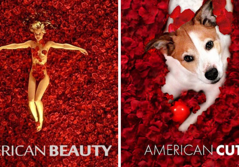
- Why Putting Your Dog on a Movie Poster Works So Well
- Before You Open Photoshop: Pick the Poster Vibe (Genre Is Your Cheat Code)
- Step 1: Get a Dog Photo That Won’t Fight You Later
- Step 2: Choose Your Poster Base (Without Creating a Copyright Headache)
- Step 3: Cut Out Your Dog Like a Professional (Yes, Even the Fur)
- Step 4: Make the Composite Believable (Scale, Perspective, and Light)
- Step 5: Color Grade Like It’s a Trailer Voiceover
- Step 6: Typography That Screams “Official Poster”
- Step 7: The Tiny Details That Make It Feel Cinematic
- Step 8: Export Settings for Web and Social (So It Doesn’t Look Like a Potato)
- Three Movie Poster Concepts You Can Make Tonight
- Common Mistakes (And How to Fix Them)
- Quick Checklist: Does Your Poster Pass the Squint Test?
- Closing Credits
- Extra: of Real-World “Poster Dog” Experience (What You’ll Learn Fast)
It started as a harmless idea: “What if my dog looked like an unstoppable action hero?” Ten minutes later, I had a “COMING THIS SUMMER” title, dramatic smoke, and a very confused pup floating three inches above the ground because I forgot shadows exist. Classic.
If you’ve ever looked at a movie poster and thought, “This would be improved by 73% with more dog,” you’re in the right place. This guide walks you through how to Photoshop your dog into movie posters in a way that looks intentionally cinematic (not accidentally cursed). We’ll cover getting the right photo, believable compositing, movie-poster typography, and the little design choices that make people squint and go, “Wait… is that a real movie?”
Why Putting Your Dog on a Movie Poster Works So Well
Movie posters are basically visual shortcuts. One glance and you already “feel” the genre: horror posters whisper danger with shadows and empty space; action posters yell in metallic fonts; rom-com posters politely flirt in bright colors. When you drop a dog into that language, the contrast is instant comedyplus the image still reads clearly because posters are built to communicate fast.
There’s also a weirdly wholesome hook: pets already have personalities. The grumpy face becomes a noir detective. The zoomies become a high-octane chase. The sleepy yawn becomes “the monster awakens.” You’re not just making a memeyou’re casting your dog.
Before You Open Photoshop: Pick the Poster Vibe (Genre Is Your Cheat Code)
Start by choosing a genre that matches your dog’s natural “brand.” This saves you hours because the pose, lighting, and color palette become obvious.
Quick genre matching ideas
- Action: alert ears, intense stare, dynamic angle, high contrast, sparks/smoke.
- Sci-fi: rim light, cool tones, fog, neon accents, “mysterious planet” background.
- Horror: side lighting, negative space, minimal type, unsettling quiet energy.
- Rom-com: soft light, pastel colors, clean typography, “meet cute” props (bandana = instant charm).
- Animated/family: bright colors, bigger type, simplified shapes, playful taglines.
Step 1: Get a Dog Photo That Won’t Fight You Later
The best Photoshop work starts with a strong photo. You don’t need a studiojust clarity, clean edges, and lighting that makes sense. Aim for a photo where your dog is:
- Sharp in the eyes (the poster lives or dies by eye focus).
- Lit consistently (window light is your best friend; harsh overhead light is your enemy).
- Shot at dog level (it instantly feels more cinematic and less “human looking down with phone”).
- Not motion-blurred unless you’re intentionally going for chaos.
Pro tip: take five minutes to shoot “poster poses” firststill portraitsbefore playtime turns your dog into a panting blur machine. Treats help. Squeaky toys help. Saying your dog’s name in a dramatic whisper like you’re announcing a Marvel villain also helps (results may vary).
Step 2: Choose Your Poster Base (Without Creating a Copyright Headache)
A lot of people start by editing an existing blockbuster poster. That can be fun, especially as parodybut it’s also where you should be careful. In the U.S., “fair use” is a case-by-case analysis (not a magic sticker that says “LOL jk”). Parody and commentary can weigh in your favor, but the details matter.
The simplest, most practical approach for a web publish: build a “movie poster style” design using your own photo and your own layout. That gives you the cinematic look without borrowing a studio’s artwork. If you do reference a famous poster, consider limiting it to personal sharing, making it clearly transformative, and avoiding commercial use. (This is not legal advicejust a reality check so your joke doesn’t become a job.)
Step 3: Cut Out Your Dog Like a Professional (Yes, Even the Fur)
Clean masking is the difference between “wow” and “why does your dog have a crunchy aura?” A solid workflow:
- Rough select: Use a selection tool to grab your dog’s general shape.
- Mask it: Convert the selection to a layer mask (non-destructive = less crying later).
- Refine edges: Zoom in on fur areas. You want soft, natural transitions, not jagged cutouts.
- Fix halos: If you see bright outlines, you likely need edge cleanup and color decontamination.
If you’re new to this: don’t chase perfection on your first pass. Get it “good,” then revisit after compositing. You’ll spot issues faster once the dog is actually in the scene.
Step 4: Make the Composite Believable (Scale, Perspective, and Light)
Your brain is a lie detector. It may not know why the dog looks pasted in, but it will know that it looks pasted in. The usual suspects: scale, perspective, and lighting direction.
Scale & perspective
- Match camera angle: if the background is shot from low angle, your dog photo should feel low angle too.
- Match lens “feel”: wide-angle backgrounds make close subjects look bigger; telephoto compresses space.
- Use guides: align paws to ground planes, door frames, horizon lines, and other perspective cues.
Shadows (aka “Stop Floating, Sir”)
Shadows sell reality. Even stylized posters usually have consistent shadow logic. Create a shadow layer under your dog and shape it to the surface: softer edges for diffuse light, sharper edges for harsh light. Reduce opacity until it feels natural. If the scene has directional light, stretch the shadow in the correct direction. If the dog is sitting, shadow should anchor the body to the groundnot hover politely nearby.
Step 5: Color Grade Like It’s a Trailer Voiceover
Movie posters rarely look like raw photos. They’re color graded for mood: teal-and-orange action vibes, desaturated horror, warm nostalgia. To blend your dog into the poster world:
- Match overall brightness: use curves/levels so the dog’s highlights and shadows sit in the same “range” as the scene.
- Match color cast: if the background is cool, your dog can’t be lit like a sunny picnic.
- Unify with a final grade: add an overall color treatment on top of everything to glue it together.
- Use targeted color matching: if one element feels “off,” bring it closer to the dominant palette.
A great trick is to temporarily blur your view (or zoom way out). If the dog pops out like a sticker, you likely need color and contrast adjustments.
Step 6: Typography That Screams “Official Poster”
Typography is where your fake movie becomes convincingly real. Posters use hierarchy: the title dominates, the tagline supports, and the fine print quietly pretends you have a distribution deal.
What to include
- Title: big, readable, genre-appropriate.
- Tagline: short and punchy (“He’s a good boy. Until he’s not.”).
- Names: your dog’s “star credit,” plus the classic “A Film By…” joke.
- Billing block: the tiny credit cluster at the bottom (optional, but it adds instant authenticity).
- Date: “Coming Soon,” “Only in The Living Room,” or an overly specific date for comedic effect.
How to pick fonts without spiraling
Don’t copy a famous studio font exactly if you’re publishing publiclyaim for the vibe. Use font ID tools to find something similar, then tweak letter spacing and weight. Condensed fonts often work well for billing blocks. For your title, pick something that matches genre: sharp serif for prestige drama, blocky sans for action, handwritten for family, and minimal type for horror.
Step 7: The Tiny Details That Make It Feel Cinematic
Once the big pieces are in place, add subtle realism:
- Grain/noise: match texture so your dog doesn’t look “too clean” compared to the background.
- Atmosphere: light haze, fog, dust, or smoke can hide seams and add depth.
- Rim light: a thin highlight on one edge can mimic dramatic lighting setups.
- Depth cues: gentle vignettes and background blur (sparingly) can focus attention.
- Props with purpose: a tiny collar tag becomes a “mysterious artifact.” A tennis ball becomes “the forbidden orb.”
Step 8: Export Settings for Web and Social (So It Doesn’t Look Like a Potato)
Posters get shared. That means your export should survive compression.
- Color space: export in sRGB for predictable web color.
- Common sizes: 1080×1350 (Instagram portrait), 1080×1920 (stories), 1200×1500 (general web).
- Sharpen lightly: a gentle final sharpen helps after resizing.
- Save a master file: keep a layered version so you can swap titles, dates, and backgrounds without rebuilding.
Three Movie Poster Concepts You Can Make Tonight
1) “The Bark Knight” (Gritty hero poster)
Use a dark city background, place your dog slightly off-center, add a cool color grade, and a bold title. Give your dog a “mask” vibe using shadow and contrastnot actual costume if your dog hates it. Tagline idea: “Justice… but make it squeaky.”
2) “Jurassic Bark” (Adventure ensemble poster)
Put your dog in the foreground with a dramatic rim light. Add fog and a distant “dinosaur silhouette” that is clearly just your other dog in a hoodie. Make the title big and classic, then slap a “COMING SOON” date like you’re opening in 4,000 theaters.
3) “Paws & Furious” (High-energy action parody)
Warm highlights, teal shadows, motion blur behind the dog, and exaggerated speed lines. Add sparks, smoke, and a subtitle like “Treat Heist.” The most important part is the attitude: a forward-leaning pose sells speed even if your dog is standing perfectly still.
Common Mistakes (And How to Fix Them)
- Halo edges: refine mask edges and remove color fringing.
- Wrong light direction: flip the dog photo or adjust shadows/highlights to match the scene.
- Dog looks too sharp: match background softness; add a touch of blur or reduce micro-contrast.
- Typography feels “DIY flyer”: simplify fonts, increase hierarchy, and align with a grid.
- Everything is centered: try off-center placement and let negative space do its job.
Quick Checklist: Does Your Poster Pass the Squint Test?
- When you squint, does the dog belong in the scene (same light, same contrast, same mood)?
- Is the title readable at phone size?
- Do shadows anchor the dog to the environment?
- Do colors feel unified (not like two photos arguing)?
- Is the joke clear in under two seconds?
Closing Credits
The magic of “I Photoshop my dog into movie posters” isn’t just the laughit’s learning real creative skills: compositing, lighting logic, typography, and storytelling in a single image. Plus, your dog gets to be the star without memorizing any lines. (Though they will demand payment in snacks.)
Extra: of Real-World “Poster Dog” Experience (What You’ll Learn Fast)
After you make a few of these, you start noticing patternsboth in your workflow and in your dog’s tolerance for your artistic ambitions. The first lesson is that the photo shoot is the project. If you begin with a blurry, overhead phone snapshot taken in a dark hallway, Photoshop becomes less of a creative tool and more of a counseling session. The moment you switch to window light, get down to eye level, and focus on the eyes, everything gets easier. You’ll spend more time designing and less time apologizing to your layer mask.
The second lesson: shadows are the entire game. Early posters often look “pretty good” until you realize your dog is hovering like a friendly ghost. Once you start building shadows deliberatelysoft vs. hard edges, direction, falloff, contact shadows at the pawsyou get a huge jump in realism with surprisingly little effort. It’s also the moment you begin to understand why movie posters look so polished: they obey lighting logic, even when they’re wildly stylized.
Third: typography is not decoration; it’s the joke delivery system. A clever title in the wrong font feels like a spreadsheet. A mediocre title in the right font feels like a movie you’d half-watch on a plane. You’ll get faster when you stop hunting for “the perfect font” and start aiming for “the correct genre.” Horror type is quiet and unsettling; action type is loud and confident; family type is friendly and round. You’ll also learn the power of spacingtracking, line breaks, and alignment make your poster look “designed” instead of “assembled.”
Fourth: your dog’s personality will steer the concept whether you like it or not. Some dogs are natural leading actorssteady eye contact, expressive eyebrows, stoic pose. Others are chaotic side characters who blink at every shutter click and turn their head exactly when you need them not to. When that happens, lean into it. A slightly goofy expression can become the heart of a family comedy poster, or the perfect “he’s not supposed to be here” twist in a thriller parody. The best posters don’t fight the dog; they cast the dog.
Finally, you’ll develop a repeatable process: pick a genre, collect a background, drop in your dog, solve scale/perspective, build shadows, match color, unify with a final grade, then add typography last. That last part matterstype should respond to the image, not the other way around. By the time you’ve made a handful of posters, you’ll start seeing real movie marketing differently. And you’ll also realize your dog has the confidence of a celebrity and the contract negotiations of a tiny, furry union representative. Payment: snacks. Trailer: treats. Sequel rights: negotiable.