Table of Contents >> Show >> Hide
- What a lithophane really is, and why monochrome ruled for so long
- The color-layer breakthrough: how makers changed the formula
- From color filters to filament painting: why the technology feels different now
- What makes a good color lithophane image
- Best materials, printers, and settings for color lithophanes
- Where color lithophanes shine best
- The limitations nobody should ignore
- Why the future of lithophanes is brighter, not just more colorful
- Experiences from the workbench: what making color lithophanes actually feels like
For years, lithophanes have been the introverts of the 3D-printing world: quiet, pale, and only truly impressive when you shine a light on them. Then the room goes silent, someone leans in, and suddenly a flat slab becomes a glowing photo with depth, shadow, and a little bit of wizardry. Traditional lithophanes do that trick in monochrome. But the latest wave of color-layer techniques proves they do not have to stay in grayscale forever.
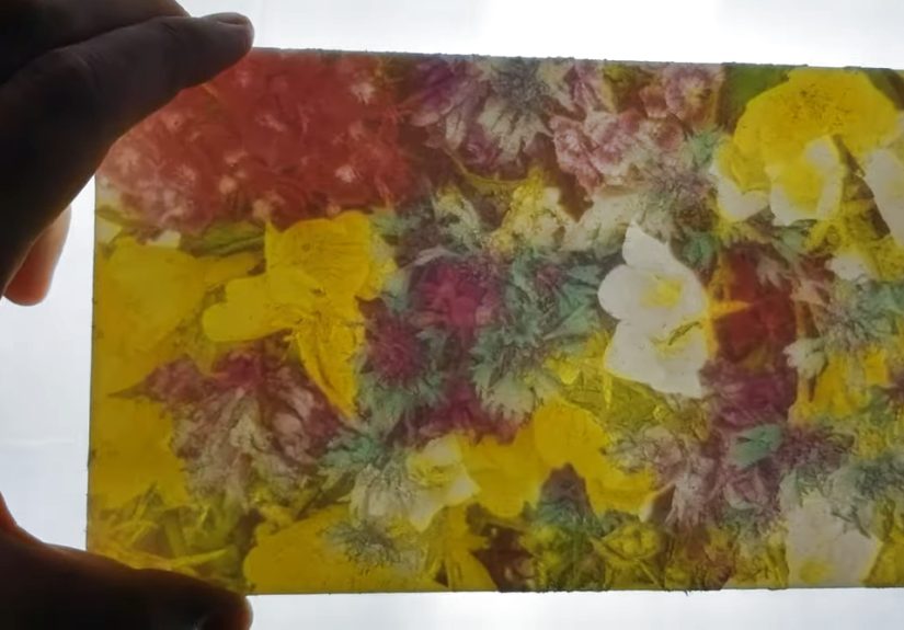
That is the big shift behind the phrase “lithophanes ditch the monochrome with a color layer.” The idea sounds simple, yet it changes everything: keep the relief-based light control that makes a 3D printed lithophane look magical, then add color in a way that works with transmitted light instead of fighting it. The result is not just a prettier print. It is a different category of object altogether: part photograph, part light filter, part optical illusion, and part excuse to say, “No, really, turn off the lamp and look at this.”
In this guide, we will break down how color lithophanes work, why the technique has become more practical, what tools and materials make the best results, and where the hype ends and reality begins. We will also look at the real-world experience of making them, because no article about glowing plastic art should pretend the first print always comes out perfect. That would be dishonest, and frankly, your printer would laugh at us.
What a lithophane really is, and why monochrome ruled for so long
A lithophane is essentially a light-controlled image made from thickness. Thinner areas let more light through, thicker areas block more light, and your eye reads those differences as highlights, shadows, and detail. In other words, the picture is not painted on the surface. The picture is the surface, translated into depth.
That is why classic lithophanes are usually printed in white or very light filament. White material acts like a better diffuser, helping backlight pass through while preserving the contrast between bright and dark regions. This also explains why monochrome dominated the format for so long. When the image is built from light transmission rather than surface color, grayscale is the most straightforward language.
Monochrome also made technical sense. It was easier to model, easier to slice, easier to print, and easier to illuminate. You could upload a photo into a lithophane generator, create an STL, print it in white PLA, and immediately get something emotionally effective. Family portraits, wedding photos, pets, landmarks, moon lamps, night lights, and memorial gifts all benefited from the format. For many makers, the appeal was that a humble printer could create something that felt oddly premium.
The color-layer breakthrough: how makers changed the formula
The old-school leap from black-and-white lithophanes to multicolor lithophanes did not come from painting the front. It came from changing the back. Instead of relying only on white thickness variation, makers began adding separate color information as thin layers or filters that sit within the print structure. When backlit, those color regions tint the transmitted light and give the image a surprisingly rich look.
That early lithophane color layer concept was clever because it preserved the core strength of lithophanes: the relief still handled brightness and contrast, while the added colored geometry behaved like a built-in filter. The front could still look mostly like a standard lithophane, but the back became a carefully organized map of color zones. This was a practical answer to a stubborn question: how do you add color to something whose image depends on light passing through depth?
The answer turned out to be: treat color as part of the transmitted-light system, not as decoration. That is the heart of the technique. Good color lithophane design is less like painting a sign and more like building miniature stained glass with plastic.
Why this mattered more than it first appeared
Once color entered the picture, lithophanes stopped being just sentimental photo gifts and started becoming display pieces. Landscapes gained warmer sunsets. Animal portraits got believable fur tones. Cartoon art became more playful. Decorative panels, lamps, and backlit wall pieces suddenly had broader visual range. A monochrome lithophane can be elegant. A good color lithophane can be theatrical.
It also expanded audience appeal. People who were not especially impressed by grayscale relief prints often understood color versions immediately. That matters if you sell printed art, make gifts, decorate a maker space, or teach with 3D printing. A color lithophane is easier to read at a glance, especially when used in a frame or light box.
From color filters to filament painting: why the technology feels different now
The modern boom in color lithophane 3D printing is not just about multi-material hardware. It is also about better software logic. Newer workflows treat a print less like a stack of simple color bands and more like an optical system with thickness, order, and transparency all working together.
This is where tools such as HueForge changed the conversation. Rather than assuming a filament’s visible color tells the whole story, the software considers how each layer filters light. That is a huge distinction. Anyone who has held a thin piece of colored filament up to a lamp already knows the truth: a spool’s surface color is only half the story. Once light shines through it, the behavior changes.
That is why modern filament painting workflows care about things like layer order, thickness, and transmission behavior. A stack of cyan, magenta, yellow, white, black, or specialty shades can create surprising blends once backlit. The print becomes a controlled light recipe. Suddenly, color lithophanes are not merely “white image plus color sticker logic.” They are closer to optical mixing by extrusion.
That also explains why some prints look stunning online but fall flat in person. The process is powerful, but it is not magic. The final image depends on the specific filament set, the thickness ranges, the backlight strength, the image quality, and the slicer settings. A great color lithophane is designed, not wished into existence.
What makes a good color lithophane image
Start with this truth: not every photo deserves to become a lithophane. Some images look excellent on a phone screen and terrible once converted into a backlit height map. Busy backgrounds, muddy lighting, tiny facial details, and low contrast can all sabotage the result.
Images that usually work well
Portraits with clean lighting, high-contrast pets, bold illustrations, logos, nature scenes with clear subject separation, and simple architectural shots usually perform well. Images with recognizable silhouettes are especially forgiving. If the subject reads clearly in grayscale, that is a very good sign.
Images that usually fight back
Dim group photos, cluttered party shots, heavy compression artifacts, and images where the subject blends into the background are troublemakers. They often produce prints that look flat, dirty, or visually confused. Color can help, but it cannot rescue weak tonal structure. Think of color as a bonus layer, not a substitute for good contrast.
Prepping the file matters more than people think
Many experienced makers clean up the photo first. That can mean removing a distracting background, increasing contrast, simplifying shadows, sharpening key edges, or converting the image to black and white to test whether it still “reads.” If the image fails the grayscale test, do not expect a color layer to save it like some kind of plastic fairy godmother.
Best materials, printers, and settings for color lithophanes
If you want sharp results, fine resolution matters. Smaller nozzles and lower layer heights generally improve detail, especially in prints meant to be viewed with transmitted light. A 0.2 mm nozzle is often recommended for higher-fidelity work, though 0.4 mm can still produce strong results when paired with careful settings. Layer heights in the finer range help keep gradients smoother and reduce chunky transitions.
Dry filament also matters more than usual. Moisture can hurt consistency, introduce print artifacts, and undermine the clarity that this style of print depends on. Smooth build surfaces are usually preferred when the face of the print needs to look crisp and polished. And because color lithophanes live or die by illumination, a consistent backlight is not optional. It is part of the design.
Material choice depends on the workflow. Traditional lithophanes still favor white PLA or similarly light translucent materials. Modern CMYK-style approaches add cyan, magenta, yellow, and white, sometimes with extra neutral shades depending on the software. The important thing is not just color family, but how the filament behaves when light passes through it. That is why experienced makers do not obsess only over hex codes. They care about transparency and transmission characteristics too.
Practical printing tips that save headaches
- Use a smooth, even backlight so the image is illuminated consistently.
- Pick images with strong subject separation and avoid visual clutter.
- Favor fine layer heights for better tonal transitions.
- Keep filament dry and stored properly before long prints.
- Test small sections before committing to a large final piece.
- Remember that the unlit print may look underwhelming; the magic happens when illuminated.
Where color lithophanes shine best
Some applications are almost tailor-made for this technology. Backlit family portraits are obvious, but far from the only option. Color lithophanes also work beautifully in custom light boxes, seasonal decorations, nursery lamps, memorial displays, pet portraits, fandom art, travel souvenirs, and educational demonstrations of optics and layered color.
There is also a commercial angle. Compared with ordinary framed prints, a backlit 3D photo feels more personal and less disposable. Compared with a standard lithophane, color makes the piece easier to market at craft fairs or online because people understand the effect faster. It photographs better, catches attention sooner, and feels more customized.
That said, the best use cases still respect the medium. A color lithophane is strongest when it is shown with light behind it, mounted cleanly, and designed around display. If you toss one in a drawer and expect it to charm people in the dark, you are basically asking a nightlight to moonlight as a cave painting.
The limitations nobody should ignore
For all the excitement, color lithophanes are not perfect digital photo reproductions. Fine color accuracy can drift. Some hues will mix differently than expected. Resolution limits can soften tiny details. The same print can look different under different lights. And the “wow” factor usually depends on viewing it in the right conditions.
There is also a learning curve. The first-time maker often discovers that a gorgeous source image can produce a muddy print, or that a nice filament set still needs tuning. Even modern tools that simplify the process cannot eliminate experimentation. They just make it more productive.
But honestly, that is part of the appeal. A successful color lithophane feels earned. It combines photography, image editing, slicer knowledge, material science, printer calibration, and display design in one deceptively flat object.
Why the future of lithophanes is brighter, not just more colorful
The biggest story is not that lithophanes can now wear color. It is that makers are getting better at treating color, light, and thickness as one unified system. That opens the door to more sophisticated framed panels, better consumer kits, customized gift products, easier software workflows, and a new generation of backlit art that sits somewhere between printmaking and additive manufacturing.
So yes, lithophanes are ditching the monochrome with a color layer. But the real upgrade is not merely aesthetic. It is conceptual. Monochrome lithophanes taught makers how to sculpt light. Color lithophanes teach them how to sculpt light with attitude.
Experiences from the workbench: what making color lithophanes actually feels like
The first time most people make a lithophane, they expect a print. What they get is an event. You pull a pale rectangle off the plate, hold it up, squint, and think, “Okay… neat?” Then you place a light behind it, and the whole object wakes up like it has been waiting to make its entrance. That moment is even stronger with a color layer, because the brain is prepared for grayscale drama and suddenly gets something closer to stained-glass photography.
One of the most common experiences with color lithophane projects is surprise at how unimpressive they can look when unlit. Beginners often assume they have failed because the front appears soft, muted, or oddly flat. Then the backlight goes on, and the colors bloom. It is a good reminder that these prints are designed for transmission, not surface beauty alone. They are less like posters and more like tiny stage sets waiting for the spotlight.
There is also the experience of chasing the “perfect” image and learning, often the hard way, that the best photo is not always the favorite photo. A beloved snapshot from a dim restaurant may carry emotional value, but it might print like a foggy memory wrapped in spaghetti-code shadows. Meanwhile, a simple outdoor portrait with clear edges and strong lighting can look incredible. Many makers discover that image editing becomes part of the creative ritual: crop the frame, boost the contrast, simplify the background, test again, and resist the urge to cram every memory into one panel.
Then comes the filament lesson. On paper, cyan is cyan, magenta is magenta, and white is white. In practice, every filament has its own personality, and some of them are drama queens. A spool that looks perfect in daylight may filter light differently once layered into a print. Makers who move beyond monochrome quickly learn to respect translucency, not just color labels. You stop thinking only like a printer operator and start thinking like someone mixing light through plastic windows.
Another common experience is how much the final display changes the emotional impact. A color lithophane taped to a random flashlight can look decent. The same piece mounted in a clean frame with an even LED panel can look gift-shop gorgeous. This is why experienced makers often say the project is not done when the printer stops. Framing, spacing, backlighting, and presentation matter. A great lithophane without a good light source is like a Broadway actor performing in a closet.
There is a social side too. Monochrome lithophanes usually get admiration. Color lithophanes get questions. People want to touch them, flip them over, and ask how the color got inside. At craft fairs, family gatherings, or maker meetups, they create the kind of curiosity that ordinary prints rarely do. That reaction is part of their charm. A color-layer lithophane feels both familiar and impossible, which is a sweet spot for handmade tech art.
And finally, there is the experience every maker knows well: the second attempt is usually the smart one. The first print teaches humility. The next one teaches control. By the third or fourth, you start choosing images more strategically, tuning layer choices more confidently, and designing the backlight on purpose instead of as an afterthought. That progression is why the topic has become so exciting. Lithophanes ditch the monochrome with a color layer not because grayscale stopped being beautiful, but because makers discovered a richer way to tell stories with light. And once you see that happen in your own hands, it is hard not to want one more print.