Table of Contents >> Show >> Hide
- Why Eric Pike’s NYC Bath Still Looks Fresh
- The Core Look: Soft Gray, Chrome, Glass, and Light
- The Shower: Open, Minimal, and Space-Saving
- The Skylight Effect: Natural Light as Luxury
- The Tile: Small-Scale, Subtle, and Structured
- The Fixtures: Chrome as Bathroom Jewelry
- The Sink: Console Style for an Airier Footprint
- The Mirror: Practical, Reflective, and Classic
- The Lighting: A Pendant With Personality
- Storage: Keep It Minimal, Not Miserable
- Budget-Friendly Ways to Steal the Look
- Common Mistakes to Avoid
- Experience Notes: Living With the Eric Pike Bathroom Look
- Conclusion
Some bathrooms whisper. Some bathrooms shout. Eric Pike’s glamorous NYC bath does neither. It gives a perfectly edited eyebrow raise, the kind of quiet confidence only a New York apartment bathroom can deliver when it knows it has good lighting, sharp fixtures, and absolutely no interest in clutter.
This look, originally admired for its clean industrial accents and soft gray palette, belongs to the downtown New York City apartment of Eric Pike, former Martha Stewart Living creative director, and Stefan Steil, an interior designer associated with Selldorf Architects. The space is small, but it does not act small. Instead, it uses a disciplined mix of gray tile, chrome, stainless steel, glass, natural light, and sculptural fixtures to create a bathroom that feels polished without becoming precious.
The magic is not in one expensive object. It is in the restraint. A glass shower without a traditional door opens the room visually. A skylight brings in natural light. Chrome and stainless steel bounce that light around like a tiny architectural disco ball, but tastefullyno Saturday Night Fever required. The result is a bath that feels glamorous, urban, practical, and timeless.
Why Eric Pike’s NYC Bath Still Looks Fresh
Design trends have a funny habit of sprinting into a room, declaring themselves “forever,” and looking exhausted three years later. This bathroom avoids that trap because it is built on classic design logic rather than decorative panic. The palette is soft gray, not trendy greige soup. The fixtures are crisp and metallic, not over-styled. The layout is open, not fussy. Every choice works hard.
Current bathroom remodeling trends still support many of the same ideas: homeowners want brighter showers, cleaner storage, wellness-oriented details, better lighting, and bathrooms that feel more spacious. Eric Pike’s bath checks those boxes before they became buzzwords. It is not trying to become a spa, a showroom, or a Pinterest board with plumbing. It is simply a highly functional small bathroom dressed in excellent tailoring.
The Core Look: Soft Gray, Chrome, Glass, and Light
The first thing to understand is the color story. Gray is the anchor, but it is not gloomy. In this bath, gray behaves like a good supporting actor: calm, flexible, and never stealing the scene. The wall tile creates a soft envelope around the room, while chrome and stainless steel add brightness and definition.
This is why the space feels glamorous without leaning on gold, marble slabs, or dramatic wallpaper. The glamour comes from reflection, proportion, and precision. Chrome faucets, a polished mirror, a stainless console sink stand, and a glass shower surface all help move light through the room. In a small NYC bathroom, light is not a decoration. It is survival gear.
How to Copy the Color Palette
Start with a soft gray tile or paint color that has a slightly warm or neutral undertone. Avoid anything too blue unless you want your morning mirror check to feel like it is happening inside a seafood freezer. Pair the gray with white porcelain, polished chrome, brushed stainless steel, and simple black or charcoal accents if you need contrast.
For towels, choose white, pale gray, slate, or one muted color such as eucalyptus green or dusty blue. The goal is not to introduce a parade. The goal is to keep the room feeling calm, edited, and expensiveeven if your actual budget is currently hiding behind the shower curtain.
The Shower: Open, Minimal, and Space-Saving
The glass shower is the move that makes the room breathe. In a small bathroom, a heavy curtain or bulky enclosure can visually chop the space into pieces. A clear glass showeror even a doorless shower where the layout allowskeeps the eye moving. The room feels wider because nothing interrupts the sightline.
Architectural Digest has long recommended glass shower doors as a way to open up small baths, and that advice applies perfectly here. Eric Pike’s bath demonstrates the concept beautifully: less visual obstruction, more light, and a cleaner architectural rhythm.
To make this idea work in a real home, pay attention to water control. A doorless shower needs proper slope, drainage, waterproofing, and enough splash clearance. This is not the place for “my cousin watched two renovation videos” confidence. Hire a professional if plumbing, waterproofing, or tile work is involved. A glamorous bathroom is fun. A glamorous leak into the downstairs ceiling is less fun, unless your downstairs neighbor enjoys indoor weather.
Steal the Shower Look
Choose clear glass if your goal is maximum openness. Use minimal hardware in chrome or polished nickel. Keep the tile consistent inside and outside the shower when possible, because continuous surfaces make a small room look larger. If you need privacy, consider reeded, fluted, or lightly frosted glass, but avoid heavy frames that make the shower feel boxed in.
The Skylight Effect: Natural Light as Luxury
One of the strongest design choices in Eric Pike’s bath is the skylight. It brings daylight into the room from above, which is especially valuable in dense city apartments where side windows may be limited or nonexistent. Natural light gives gray tile more dimension, makes chrome sparkle, and turns a practical shower into a small daily ritual.
Not every bathroom can have a skylight, of course. Apartments, condos, and lower floors may not have that option. But you can borrow the effect. Use layered lighting, backlit mirrors, glass shades, reflective tile, and well-placed ceiling fixtures to create brightness from multiple directions. The goal is to avoid one sad overhead bulb performing a one-person play called “Everyone Looks Tired.”
How to Fake Better Natural Light
Install lighting at the vanity for grooming, soft ambient lighting overhead, and waterproof-rated lighting in the shower when allowed by code. A large mirror can help bounce light deeper into the room. Glossy or satin tile can also reflect light, though too much shine may show water spots. Balance is the secret. You want glow, not airport restroom.
The Tile: Small-Scale, Subtle, and Structured
The original look uses neutral ceramic tile with a clean, architectural feeling. This is not a bathroom that depends on loud pattern. Instead, the tile provides texture, scale, and repetition. The effect is calm but not boring. Think of it as the bathroom equivalent of a perfect gray suit: simple from across the room, beautifully detailed up close.
For a similar result, consider ceramic subway tile, stacked rectangular tile, or small-format field tile in gray, ivory, or off-white. A glossy finish will reflect more light, while matte tile feels softer and more understated. If the room is very small, keep grout lines controlled and choose a grout color close to the tile color for a quieter look.
Current remodeling trends show growing interest in larger-format surfaces and fewer grout lines, largely because homeowners want easier maintenance. Still, small-format tile can look wonderful when it is installed precisely and cleaned regularly. The trick is to use it intentionally, not because it was on sale next to a broken sample board.
The Fixtures: Chrome as Bathroom Jewelry
Chrome is back in the design conversation, but Eric Pike’s bath never needed permission. Chrome works here because it is clean, reflective, affordable compared with many specialty finishes, and historically at home in bathrooms. It adds polish without adding visual weight.
Better Homes & Gardens has noted chrome’s renewed appeal in 2025, especially for bathrooms, where its reflective quality can brighten a room. In this NYC bath, chrome and stainless steel act like jewelry: the mirror frame, shower fittings, console sink stand, and lighting all create small points of shine.
How to Use Chrome Without Making It Feel Cold
Repeat chrome in at least three places: faucet, mirror, and shower hardware, for example. Then soften the room with towels, a small basket, or a warm-toned accessory. Chrome can feel too sharp if everything else is hard and icy. A little texture keeps the room human.
Also, do not mix every metal under the sun. Chrome can play nicely with stainless steel, polished nickel, blackened steel, or even a small brass accent, but too many finishes can make a small bath look like a hardware store had a group project.
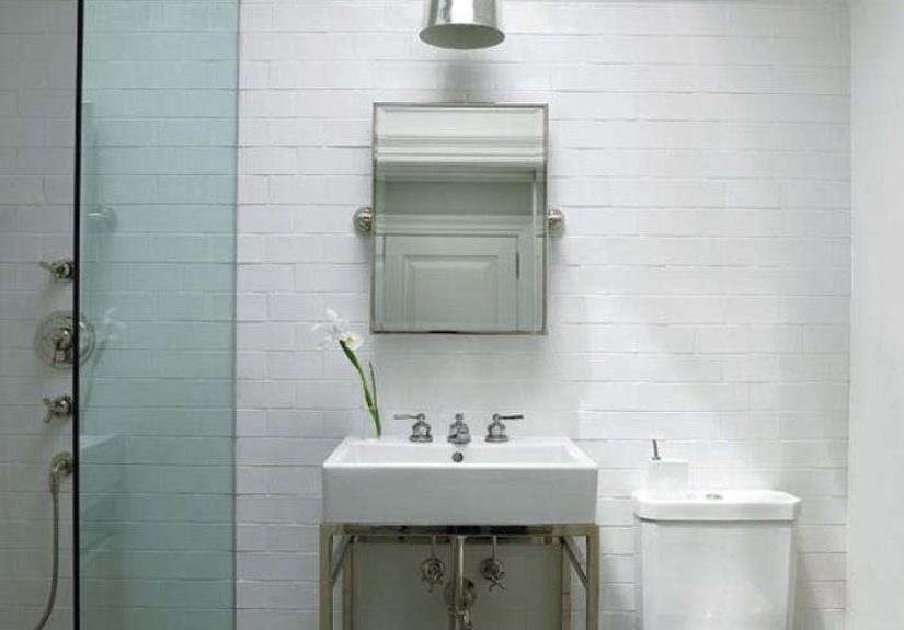
The Sink: Console Style for an Airier Footprint
A console sink is one of the smartest choices for this kind of bathroom. It gives you a usable basin without the bulky visual mass of a cabinet vanity. In Pike’s bath, a stainless or chrome-style stand keeps the floor visible, which helps the room feel lighter and more open.
The trade-off is storage. A console sink looks elegant, but it does not hide three half-empty bottles of conditioner, a backup toothbrush army, and that one hotel lotion you have emotionally committed to keeping forever. If you choose a console sink, plan storage elsewhere: recessed medicine cabinet, wall hooks, a wire basket, a narrow shelf, or a small cabinet outside the bathroom.
Best Console Sink Pairings
Pair a console sink with a rectangular tilting mirror, wall-mounted towel bar, and slim soap dispenser. Keep the counter surface nearly empty. One tray is fine. Five decorative objects are not. The whole point is that the sink looks architectural, not like a tiny stage for skincare chaos.
The Mirror: Practical, Reflective, and Classic
A rectangular wall-mounted tilting mirror is a strong choice because it feels both vintage and modern. It also adds function. A tilting mirror can adjust for different users and angles, making it more useful than a purely decorative mirror.
In a small bathroom, a mirror is not just a mirror. It is a space-expanding device. A larger reflective surface can brighten the room, double the visual depth, and make the vanity area feel more finished. For the Eric Pike look, choose a chrome, nickel, or stainless-framed mirror with clean lines. Avoid ornate frames unless you want the room to wander into hotel-lobby territory.
The Lighting: A Pendant With Personality
The original source references a silver suspension lamp, giving the bathroom a sculptural touch. That matters. Small bathrooms often get boring lighting because people treat them as purely functional spaces. But a thoughtfully chosen pendant, sconce, or ceiling fixture can make the room feel designed rather than merely assembled.
Choose a fixture that is bathroom-safe for the location where it will be installed. Moisture ratings matter. A beautiful light that is not suitable for a bathroom is not glamorous; it is a future maintenance problem wearing eyeliner.
Lighting Formula for the Look
Use one statement fixture for atmosphere, mirror lighting for the face, and shower lighting if the layout needs it. Keep the finish in the same metallic family as the plumbing. If the ceiling is low, choose a flush-mount or semi-flush fixture with a reflective or glass element.
Storage: Keep It Minimal, Not Miserable
This look depends on visual quiet. That means storage must be intentional. Wire bins, wall hooks, recessed cabinets, and slim shelves can hold essentials without overwhelming the room. A rustic wire basket with rolled towels can soften the chrome and tile while still feeling organized.
But minimalism should not require daily suffering. If you actually use seven products in the shower, design storage for seven products. The best bathroom is not the one that looks perfect for a photo and then collapses into chaos by Tuesday. Build in niches, use lidded containers, and edit what stays visible.
Budget-Friendly Ways to Steal the Look
You do not need luxury fixtures to capture the mood. The look is more about discipline than price. Start by painting the walls a soft gray or warm white. Replace mismatched hardware with chrome. Upgrade the mirror. Add a glass shower panel if your budget allows. Swap bulky accessories for slim, reflective, or wire pieces.
If you are not remodeling, focus on the surface layer: towels, lighting, mirror, faucet, hooks, shower curtain or glass panel, and storage baskets. Even a basic rental bathroom can borrow the mood with a gray-and-white palette, polished chrome accessories, and a strict ban on countertop clutter.
High-Low Shopping Strategy
Spend more on pieces you touch daily: faucet, showerhead, mirror, and lighting. Save on accessories such as baskets, towel hooks, trays, and towels. Tile is worth careful selection because it is expensive to replace. Trendy soap dishes, however, do not need to be treated like family heirlooms.
Common Mistakes to Avoid
The first mistake is using too many materials. This look works because the palette is tight. Gray tile, white porcelain, chrome, stainless steel, glass, and simple textiles are enough. Add marble, brass, black fixtures, patterned wallpaper, wood slats, and colorful tile all at once, and suddenly the bathroom is hosting a design committee meeting with no chairperson.
The second mistake is ignoring lighting. Gray bathrooms can become flat if they are poorly lit. Add layers. Let the mirror reflect light. Choose bulbs with a flattering color temperature. Test paint and tile samples in morning and evening light before committing.
The third mistake is copying the look without adapting it. A doorless shower is elegant only if the bathroom can handle water properly. A console sink is beautiful only if you have another storage plan. A skylight is dreamy only if it is installed correctly. Good design is never copy-paste. It is translation.
Experience Notes: Living With the Eric Pike Bathroom Look
The real test of a glamorous bathroom is not how it looks in a photo. It is how it behaves on an ordinary morning when someone is late, the towel is damp, and the toothpaste cap has mysteriously joined the witness protection program. That is where the Eric Pike look proves its value. Because the palette is calm and the materials are straightforward, the room does not demand constant styling. It already has a point of view.
Living with a gray, chrome, and glass bathroom teaches you that restraint can feel luxurious. You begin to notice small details: the way morning light hits the mirror, the way chrome catches a reflection from the shower glass, the way a rolled white towel can look far more elegant than a pile of mismatched textiles. The room encourages better habits, not by scolding you, but by making clutter look wildly out of place. It is hard to leave six bottles on the sink when the sink clearly believes it is part of an architectural photograph.
The open-shower concept also changes the daily experience. A glass shower feels lighter than a curtain, and that openness can make even a compact bath feel more generous. But it also requires discipline. Glass needs regular cleaning. A squeegee becomes less of an optional accessory and more of a small household employee. The good news is that a quick wipe after each shower keeps the room looking sharp. The bad news is that the squeegee will never receive the emotional praise it deserves.
Chrome fixtures are surprisingly forgiving if you clean them often and gently. They show water spots, yes, but they also shine back quickly. That is part of the charm. Chrome gives instant feedback. Ignore it for two weeks, and it looks annoyed. Give it five minutes, and it behaves like jewelry again.
The most useful lesson from this bathroom is that small spaces need confidence, not compromise. Many people treat a small bath as a place to hide basic fixtures and hope nobody notices. Eric Pike’s bath does the opposite. It gives the small room a strong identity: industrial, polished, quiet, urban, and bright. That identity makes the room feel intentional.
For anyone trying this at home, the best experience-based advice is simple: decide what the bathroom is allowed to be, then remove everything that argues with that idea. If the look is glamorous NYC minimalism, skip the beach signs, the rustic farmhouse shelf, and the rainbow towel collection. Keep the lines clean. Let the light do its job. Choose fewer, better details. And remember, a small bathroom can absolutely have big styleas long as the style knows when to stop talking.
Conclusion
Eric Pike’s glamorous NYC bath remains compelling because it understands the rare art of doing enough. The soft gray palette creates calm. The chrome and stainless steel accents add shine. The glass shower expands the room visually. The skylight turns natural light into a design feature. Every element has a role, and nothing seems desperate for applause.
To steal this look, focus less on buying the exact objects and more on copying the design principles: restraint, reflection, openness, and precision. Choose a tight palette. Repeat metallic finishes. Make the shower feel transparent. Use lighting generously. Keep storage smart and quiet. The result is a bathroom that feels glamorous without becoming loud, practical without becoming plain, and urban without trying too hard.
Note: This article is original editorial content synthesized from real interior design references, bathroom product information, and current U.S. remodeling trends.