Table of Contents >> Show >> Hide
- Why Paint Color Matters So Much in Resale
- The Best Paint Colors to Help You Sell for More
- Exterior Colors That Boost Curb Appeal
- Colors That Can Hurt Your Sale Price
- How to Choose the Right Paint Color for Your Specific House
- The Real Strategy: Balance Personality With Broad Appeal
- What Sellers and Agents Actually Experience With These Colors
- Final Thoughts
Selling a house is part economics, part psychology, and part “please ignore the weird lime-green wall I loved in 2021.” Paint color sits right in the middle of all three. It is one of the fastest, cheapest ways to change how buyers feel about a home, how listing photos perform online, and how much work a buyer thinks they will need to do after closing.
That matters because buyers do not walk through a property with a calm spreadsheet brain. They walk in, glance around, and make snap judgments. Does this place feel fresh? Does it feel expensive? Does it feel like home? Or does it feel like a weekend repainting marathon waiting to happen?
For years, conventional wisdom said sellers should paint everything white and call it a day. Today, the picture is more nuanced. Soft neutrals still matter, especially for broad appeal. But newer buyer research and design guidance suggest that the right darker, nature-inspired tones can make a home feel richer, more current, and more memorable in a good way. In other words, buyers may still love a blank canvas, but they no longer want that canvas to look like a dentist’s waiting room.
If your goal is to sell your house for more, these are the paint colors and strategies worth paying attention to before you list.
Why Paint Color Matters So Much in Resale
A fresh paint job does more than cover scuffs. It signals maintenance. It makes rooms look cleaner, brighter, and more intentional. It also helps buyers picture their own furniture, style, and routine in the space. That is why interior painting is often considered one of the most affordable pre-listing updates with strong resale potential.
Paint also affects perception in photos. A home with well-chosen wall color tends to look more polished in listing images, and that first impression matters because many buyers decide whether to visit in person within seconds of scrolling. Warm, balanced colors can make a house feel inviting. Harsh, polarizing shades can make buyers mentally subtract money before they even park the car.
The smartest approach is not to choose the trendiest shade on earth. It is to choose colors that make your house look cared for, current, and easy to move into. That sweet spot is where value usually lives.
The Best Paint Colors to Help You Sell for More
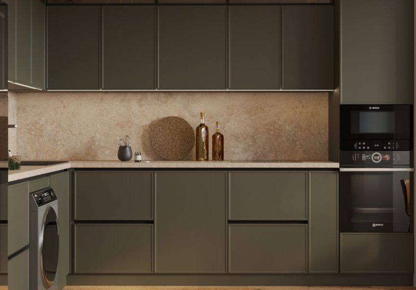
1. Olive Green in the Kitchen
If one room has stolen the resale-color spotlight, it is the kitchen. Recent buyer research points to olive green as one of the strongest choices for boosting perceived value in this space. That makes sense. Olive green feels grounded, organic, and upscale without being loud. It works especially well on cabinets, islands, and even lower cabinetry paired with lighter counters and warm hardware.
The charm of olive green is that it reads as design-forward without feeling reckless. It nods to natural materials like wood, stone, and brass, which buyers already associate with quality. It can make a kitchen feel custom rather than cookie-cutter. That is a big deal in a market where buyers are comparing listings side by side and trying to decide which one feels the most finished.
Just do not take “olive green” to mean “muddy swamp surprise.” Choose a muted, elegant version with depth. Pair it with off-white walls, matte black fixtures, or warm metallic accents. The result is less “forest cosplay” and more “I have excellent taste and likely organized my spice drawer.”
2. Navy Blue in the Bedroom
Bedrooms benefit from colors that feel restful, cocooning, and just polished enough to suggest retreat. Navy blue checks all those boxes. A deep blue bedroom can feel calm, classic, and slightly luxurious, which is exactly the energy sellers want in a primary suite.
The reason navy works is that it behaves like a decorative neutral when styled well. It pairs beautifully with white bedding, wood nightstands, brass lamps, and soft textiles. It adds drama without chaos. Buyers often respond well to a bedroom that feels finished but not fussy, and navy can create that balance better than many paler shades.
If your room is tiny and cave-like, use navy thoughtfully. In a well-lit bedroom, it can feel rich and serene. In a dark box with one sad window, it can feel like bedtime at 2 p.m. Context always matters.
3. Dark Gray or Charcoal in the Living Room
Here comes the curveball: dark gray still has resale power when used correctly. In living rooms, deeper charcoal tones can create a cozy, sophisticated backdrop that feels expensive, especially when the room gets decent natural light. While many homeowners assume pale beige is the only safe answer, darker neutrals can make a main living space feel more tailored and memorable.
The secret is choosing a charcoal that feels architectural, not gloomy. Think soft blackened gray, smoky graphite, or deep warm gray. These colors play well with cream upholstery, oak floors, layered lighting, and textured textiles. They also photograph beautifully, which is a not-so-small bonus in online listings.
That said, dark gray works best when the room has enough light and contrast. If everything in the room is also dark, buyers may feel like they are touring a stylish cave. A good living room needs visual breathing room.
4. Mid-Tone Brown in the Bathroom
Bathrooms are often treated like color afterthoughts, which is strange because buyers absolutely notice them. Warm mid-tone brown, taupe, or mocha-inspired shades can perform surprisingly well here because they add warmth and richness while still feeling clean and spa-like. Done well, these shades make a bathroom feel intentional instead of sterile.
Warm browns are especially effective when paired with white tile, natural wood, brushed brass, or black accents. They soften hard surfaces and can make a bathroom feel more relaxing. In resale terms, that is useful because buyers love spaces that feel finished, calm, and a little indulgent.
No, you do not need to turn the powder room into a chocolate truffle. Aim for earthy elegance, not pudding.
5. Warm Whites, Creams, and Greige Almost Everywhere Else
Now for the dependable classics. Warm whites, creamy off-whites, and soft greige remain resale workhorses for a reason. They make rooms feel larger, brighter, and easier to personalize. They also help connect one room to the next, which gives the whole house a more cohesive flow.
Today’s better neutrals are warmer than the stark whites and icy grays that dominated in years past. Buyers are increasingly drawn to homes that feel comfortable, not clinical. That means whites with softness, beiges with subtle depth, and greiges that do not look silver under every light bulb.
If your house has mixed finishes, older flooring, or lots of open sightlines, a warm neutral can be the best value move of all. It smooths visual noise and lets the architecture do the talking.
Exterior Colors That Boost Curb Appeal
Interior paint matters, but the exterior is your opening sentence. If buyers do not like the first sentence, they may never read chapter one.
Warm White Exteriors
Warm white remains one of the safest and strongest exterior colors for resale. It feels crisp without looking harsh, timeless without looking sleepy, and it works across many architectural styles. Unlike cold bright whites, warm whites tend to flatter stone, brick, landscaping, and natural light.
This is one reason designers and paint brands continue to recommend shades that feel creamy, soft, and welcoming rather than stark and bluish. On listing photos, a warm white exterior can look clean, high-end, and move-in ready.
Soft Greige, Taupe, and Nature-Based Neutrals
For homes that need more warmth and depth, greige, taupe, sandstone, and other earth-leaning neutrals are strong choices. These colors often look especially good on traditional homes, homes with stone elements, and houses in neighborhoods where bright white might feel too severe.
Nature-based exteriors tend to age well because they harmonize with permanent elements like roofing, brick, trees, and the surrounding streetscape. Buyers may not articulate it this way, but they often respond well to a house that feels like it belongs.
Black Front Doors and Strategic Dark Accents
While an all-black exterior can be a love-it-or-hate-it move, black on the front door is a different story. A black front door often reads as classic, confident, and upscale. It creates contrast, sharpens the facade, and gives buyers a visual focal point before they ever touch the lockbox.
Dark shutters, trim, or carefully chosen accents can work too, but restraint matters. The goal is not to make your house look like it is auditioning for a gothic reboot. The goal is to create polish and contrast.
Colors That Can Hurt Your Sale Price
Some colors may delight you personally and still be terrible for resale. That is the harsh little comedy of selling a home. The most commonly flagged troublemakers are bright yellow, strong red, lime green, pink, and other highly personal hues that dominate a room instead of supporting it.
Yellow can feel cheerful in moderation, but in kitchens or living rooms it can quickly veer into visual caffeine. Red often makes rooms feel smaller, busier, and more dated unless handled by a very skilled designer. Neon or ultra-saturated tones can make buyers assume repainting is urgent, which means they start mentally deducting both money and effort.
Even gray can backfire when it is too cold, flat, or overused. The old “safe gray everywhere” formula is losing favor. Buyers still like sophistication, but they increasingly want it delivered through warmth and depth rather than chilly sameness.
How to Choose the Right Paint Color for Your Specific House
Look at Fixed Finishes First
Paint should work with your floors, counters, tile, stone, cabinetry, and trim. A color that looks fabulous on a swatch can look strange next to orange-toned oak or pink-beige tile. Start with what is not changing, then choose paint that flatters those finishes.
Think About Light
North-facing rooms often read cooler. South-facing rooms can amplify warmth. A color that looks creamy at noon might look yellow at sunset. Sample before committing. Yes, this is annoying. It is still cheaper than repainting an entire room because your “perfect neutral” turned into banana yogurt.
Respect the Neighborhood
For exteriors especially, do not be the outlier unless you are absolutely sure it helps. A house that feels wildly disconnected from the neighborhood can limit buyer appeal. Stand out for being beautiful, not confusing.
Use the Right Finish
Finish affects perception. Flat ceilings help hide imperfections. Matte walls can look smooth and upscale. Semi-gloss trim can feel crisp and clean. A gorgeous color in the wrong sheen can look surprisingly wrong, so finish is not a tiny detail. It is part of the whole package.
The Real Strategy: Balance Personality With Broad Appeal
The goal is not to erase all personality from your home. It is to remove barriers between the buyer and the offer. That may mean keeping the olive kitchen, deepening the living room to charcoal, refreshing the bedroom in navy, or warming up a whole-house palette with cream and greige. It may also mean repainting that bright red dining room you swore was “bold and European.” It was bold, yes. European is harder to verify.
The most effective paint strategy combines three things: current buyer preferences, timeless undertones, and a realistic understanding of your home’s architecture and lighting. Get those right, and paint becomes more than decoration. It becomes leverage.
What Sellers and Agents Actually Experience With These Colors
Talk to sellers, stagers, and agents long enough, and a pattern appears. The homes that feel easiest to sell are rarely the ones with the loudest color stories. They are the ones where paint quietly makes everything else look better. Floors look richer. Trim looks sharper. Light bounces better. Buyers stop noticing the walls and start imagining where their sofa would go. That shift is huge.
One common experience is that a repaint changes the mood of the home before it changes the price. Sellers often say the house suddenly feels cleaner and newer, even when nothing else changed. That matters because buyers are reading condition through emotion. A warm white hallway, a moody-but-restful navy bedroom, or an olive-toned kitchen can make the entire property feel more curated. It gives the impression that the home has been cared for thoughtfully rather than patched together right before listing day.
Another frequent experience involves photos. Colors that seemed ordinary in person can look fantastic online if they create contrast and depth. This is where charcoal living rooms and warm exterior whites really earn their keep. In listing images, they can make millwork, furniture, and natural light pop. By contrast, overly bright or icy colors often flatten out or create awkward undertones on camera. Sellers may love a wall in person, then see the photos and realize the room looks harsher, darker, or cheaper than it does in real life. The camera is honest in a slightly rude way.
Agents also talk about the “repaint objection.” Buyers walk into a house with a very specific color palette and immediately start a mental renovation list. Even if repainting is relatively easy, it becomes one more task in their head, and one more reason to negotiate. But when buyers walk into a home with appealing neutrals or tasteful deeper shades, they often assume they can move in without changing much. That creates momentum. Momentum creates confidence. Confidence writes stronger offers.
There is also the issue of undertones, which experienced sellers learn quickly. A white that looked soft in the store can turn pink, green, blue, or yellow depending on the room. That is why test patches matter so much. Many sellers discover that the best resale color is not the trendiest one, but the one that makes the existing counters, flooring, and cabinetry stop fighting with each other. Harmony beats hype almost every time.
Finally, many sellers are surprised to find that darker colors can work when they are intentional. A navy bedroom can feel elegant, not heavy. An olive kitchen can feel expensive, not risky. A black front door can feel classic, not severe. The winning experience is usually not “paint everything one color.” It is “choose color with purpose.” When paint supports the home’s light, layout, and materials, buyers feel that difference immediately, even if they cannot explain it. They just know the house feels right. And in real estate, “this feels right” is often one small sentence away from “let’s make an offer.”
Final Thoughts
If you want to sell your house for more, paint is one of the smartest low-drama updates you can make. The best choices right now blend warmth, sophistication, and broad buyer appeal. Olive green can elevate a kitchen. Navy can make a bedroom feel luxurious. Charcoal can give a living room depth. Mid-tone brown can warm up a bathroom. Warm whites, creams, and greige can tie the whole home together. And on the exterior, warm neutrals and a sharp black front door can boost curb appeal before buyers even step inside.
The big takeaway is simple: buyers want homes that feel current, comfortable, and easy to love. Choose paint colors that help them get there fast, and your walls may end up doing more selling than you expected.