Table of Contents >> Show >> Hide
- What Sherwin-Williams Is Really Saying With This Forecast
- The 2026 Palettes, Decoded for Real Homes
- Spotlight: Universal Khaki (SW 6150), Sherwin-Williams 2026 Color of the Year
- DIYers, Here’s How to Use Trend Colors Without Messing It Up
- Step 1: Light is your co-designertest for it
- Step 2: Sample smarter (and bigger than you think)
- Step 3: Pick the right sheen for the job
- Step 4: Prep is the secret ingredient (and it’s cheaper than paint)
- Step 5: Primer isn’t optional when you’re making a big color jump
- Step 6: Edges and tapesmall details, big difference
- Step 7: Use a simple palette rule so your room feels “designed”
- Room-by-Room Color Recipes Using the Colormix 2026 Vibes
- Common DIY Color Mistakes (So You Don’t Become a Cautionary Tale)
- DIY Experiences & Real-World Lessons From Painting With Trend Colors (Extra )
- Conclusion
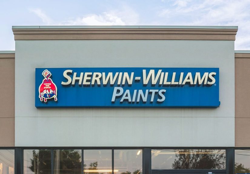
If you’ve ever stood in the paint aisle holding nine “almost-the-same” beige chips and questioning every life choice
you’ve ever madewelcome. The good news: Sherwin-Williams did a lot of the heavy trend-lifting for you in its latest
Colormix® Forecast. The even better news: you don’t need a design degree (or a trust fund) to use these colors like a pro.
Sherwin-Williams’ newest trend report, Colormix® Forecast 2026: AnthologyVolume Two, is a curated set of
48 hues organized into four “color families” that are designed to feel usable, not museum-only. Think:
airy pastels that don’t read “nursery,” warm sunbaked tones that look like you travel, restorative darks that make a room
feel expensive, and neutrals with actual personality. Bonus: the 2026 Color of the YearUniversal Khaki (SW 6150)
comes from this forecast, which means it’s meant to play nicely with the rest of the lineup.
What Sherwin-Williams Is Really Saying With This Forecast
Past color forecasts often felt like “Pick your vibe: desert modern, coastal grandma, or moody vampire library.” This one
is more practical. The report leans into color evolutionhow familiar families (tints, warm hues, darks, neutrals)
keep changing as our homes change. Translation for DIYers: you can adopt what’s trending without repainting your entire life.
Four palettes, one big idea: comfort with character
The four 2026 palettes are:
Frosted Tints (milky pastels),
Sunbaked Hues (warm yellows/reds/golds),
Restorative Darks (deep, grounding shades),
and Foundational Neutrals (layerable modern neutrals).
Together, they tell a story: homes are craving calmbut not bland. Cozybut still interesting.
The 2026 Palettes, Decoded for Real Homes
1) Frosted Tints: Pastels, but make them grown-up
Frosted Tints are the whisper-soft colors that look like they’ve been filtered through morning fog: hazy lavenders,
gauzy blues, and gentle aquas/greens. They’re “light and airy,” but not sterileespecially when you anchor them with
warm woods, textured linens, matte black hardware, or a single darker contrast piece.
DIY-friendly ways to use Frosted Tints:
- Whole-room calm: Try a pale blue-green (like Tradewind or Watery) in a bedroom with warm white trim and natural fiber rugs.
- Ceiling surprise: Put a frosted tint on the ceiling for a subtle “designer” move that still feels safe.
- Bathroom refresh: A soft aqua or misty lavender pairs beautifully with chrome, brushed nickel, and stone-look tile.
Pairing tip: Frosted Tints look best when you keep the surrounding finishes simpleclean lines, minimal clutter,
and one or two materials repeated (wood + linen, or stone + brass). The color is the mood; don’t make it fight your stuff.
2) Sunbaked Hues: Warmth that feels collected, not chaotic
Sunbaked Hues are where the forecast turns up the temperature: buttery yellows, earthen mauves, pink sandstone,
and adobe-inspired reds/oranges. Sherwin-Williams nods to a midcentury-style warmth herecolors that feel like
late-afternoon sun hitting terracotta.
DIY-friendly ways to use Sunbaked Hues:
- Kitchen or breakfast nook: A soft yellow (think Lemon Chiffon or Sundew) adds warmth without screaming “banana.”
- Front door confidence: A richer red/orange (like Pennywise or Cajun Red) can make an entry feel intentionalinstantly.
- Accent wall that doesn’t regret you: Try a muted warm tone behind open shelving or in a dining room with warm bulbs.
Pairing tip: These colors love warm metals (brass, aged bronze) and earthy surfaces (oak, walnut, clay pottery).
If a Sunbaked shade feels “too much,” don’t abandon itjust shrink it: a powder room, a hallway, or built-ins.
3) Restorative Darks: Moody, grounded, and surprisingly livable
Restorative Darks are deep hues designed to feel comfortinglike a weighted blanket, but for your walls. Think
shadowy bronzes, coppery reds, plum-browns, and night-sky blacks/blues. The trick with dark paint isn’t bravery;
it’s strategy: control sheen, add layered lighting, and balance with lighter surrounding surfaces.
DIY-friendly ways to use Restorative Darks:
- Home office “focus mode”: Try a deep, grounding shade behind your desk with warm task lighting.
- Color-drenching done right: Paint walls + trim the same dark color in a small room (powder room, snug, reading corner) for a high-end look.
- Lower half walls or built-ins: A dark base with a lighter wall above feels classic and hides scuffs.
Pairing tip: Dark paint looks more “designer” in a softer sheen (often matte/eggshell on walls). Glossy dark walls
can look like a bowling alleyunless you’re specifically going for “dramatic lacquered jewel box.”
4) Foundational Neutrals: The new “easy” backdrop (with more depth)
Foundational Neutrals are not here to be boring. They’re clean whites, light taupes, silvery grays, crisp khakis,
plus deeper stormy tones that add contrast. This palette is built for layering: you can mix multiple neutrals in one
space (walls, trim, cabinetry) and still feel cohesive.
DIY-friendly ways to use Foundational Neutrals:
- Open-concept harmony: Use one mid-tone neutral on main walls and shift to a lighter neutral in hallways/adjacent rooms to keep flow.
- Trim refresh: Crisp whites like White Snow can make older spaces feel instantly cleaner and brighter.
- Soft modern contrast: Pair a warm neutral wall with a darker neutral on doors or an island for depth.
Spotlight: Universal Khaki (SW 6150), Sherwin-Williams 2026 Color of the Year
Yes, the Color of the Year is a neutral. No, you’re not doomed to another decade of “greige.” Universal Khaki is a
mid-tone neutral with a subtle yellow undertone that reads warm, grounded, and flexible. It’s the kind of color
that can feel modern classic in one house and quietly rustic in anotherdepending on what you pair it with.
Where Universal Khaki shines:
- Main living areas: It’s steady enough for open spaces, but warm enough to feel inviting at night.
- Kitchens: Works well with warm whites, natural wood, and darker accents (like inky blue-black) for contrast.
- Hallways: A surprisingly smart choice for “connector” areas that often look forgotten.
Color pairing cheat codes:
Want calm? Pair Universal Khaki with a frosted tint (misty blue/green). Want energy? Add a Sunbaked accent (soft yellow or terracotta).
Want drama? Bring in a Restorative Dark on a door, built-in, or powder room.
HGTV Home by Sherwin-Williams “Honest Essentials” (bonus palette inspiration)
If you like a curated set that’s basically a “no wrong answers” starter pack, HGTV Home by Sherwin-Williams released a
2026 Color Collection of the Year called Honest Essentials, anchored by Universal Khaki and supported by warm neutrals,
earthy accents, and nature-inspired blues/greens. It’s a handy reference if you want a pre-built palette without the mental math.
DIYers, Here’s How to Use Trend Colors Without Messing It Up
Step 1: Light is your co-designertest for it
The same paint can look dreamy at 10 a.m. and like a totally different life decision at 8 p.m. Undertones matter:
beige can pull pink, yellow, or gray; blues can lean green or purple. Test samples in multiple spots and look at them
across the day before you commit.
Step 2: Sample smarter (and bigger than you think)
Tiny chips lie. At minimum, paint a large swatch (or use peel-and-stick samples) and evaluate next to your flooring,
cabinets, and big furniture. Pro move: paint the sample on poster board so you can move it around the room and see it
in shadow vs direct light.
Step 3: Pick the right sheen for the job
Sheen isn’t just “shiny vs not shiny.” It affects durability, how much wall texture shows, and how “luxurious” a color looks.
In general: flatter finishes hide imperfections; higher sheens handle moisture and cleaning better. Bathrooms and trim usually
appreciate satin or semi-gloss; living rooms often look best in eggshell.
Step 4: Prep is the secret ingredient (and it’s cheaper than paint)
Want fewer coats and a smoother finish? Clean first, repair second, then scuff-sand glossy areas so paint can grip.
Dust and grime can sabotage adhesionespecially in kitchens, bathrooms, and high-touch hallways.
Step 5: Primer isn’t optional when you’re making a big color jump
If you’re going from pale to dark (or dark to pale), primer can save you time and coats. One popular pro trick:
tint your primer when covering a dramatic color shift. It helps coverage and reduces the “why is this taking forever?” phase.
Step 6: Edges and tapesmall details, big difference
Clean lines make DIY paint look professional. Use painter’s tape correctly (press it down well, especially in corners),
and remove it carefully. If you wait until the paint fully cures, you can accidentally peel paint with the tape.
Step 7: Use a simple palette rule so your room feels “designed”
If you’re mixing multiple forecast colors, the classic 60-30-10 guideline can keep you from creating a circus:
60% dominant (usually walls), 30% secondary (furniture/rugs), 10% accent (art, pillows, a bold door).
Room-by-Room Color Recipes Using the Colormix 2026 Vibes
- Calm bedroom: Frosted tint walls (misty blue/green), warm white trim, linen bedding, wood nightstands, soft brass lamp.
- Sunny kitchen nook: Soft Sunbaked yellow on a breakfast area, neutral main walls, warm wood table, woven chairs.
- Modern living room base: Universal Khaki on walls, crisp white ceiling/trim, dark neutral accents (frames, a door, or built-ins).
- Powder room drama: Restorative Dark color-drench (walls + trim), bold mirror, warm sconce lighting, simple art.
- Entryway glow-up: Foundational neutral walls, Sunbaked front door, textured runner, and one statement hook rail.
Common DIY Color Mistakes (So You Don’t Become a Cautionary Tale)
- Choosing paint at night under one overhead bulb and calling it “tested.” (It was not tested.)
- Ignoring undertones and then wondering why your “warm neutral” looks green next to your floor.
- Using the wrong sheen and accidentally spotlighting every drywall patch like it’s on stage.
- Skipping prep and then blaming the paint when it peels or flashes.
- Going trendy everywhere instead of using trend colors like seasoningenough to taste, not enough to overwhelm.
DIY Experiences & Real-World Lessons From Painting With Trend Colors (Extra )
Here’s the funny thing about “trend colors”: they’re not hard to use because they’re trendy. They’re hard to use because
paint is basically mood lighting in liquid form. The same shade that looks chic in a styled photo can look wildly different
in a real home with real windows, real bulbs, and real-life clutter (like backpacks, dog toys, and that one chair that’s
basically a laundry witness protection program).
One of the most common DIY wins with a forecast like Colormix 2026 is starting small. People see Sunbaked Huesthose
glowing yellows and terracotta-inspired tonesand assume they have to commit to an entire living room. In practice,
the happiest outcomes tend to come from “contained” projects: a powder room, a pantry door, a single wall in a dining
area, or even just the back of open shelving. It’s easier to control lighting and contrast, and you get that punch of
personality without the emotional labor of repainting everything if it feels like too much.
Frosted Tints are another surprise success storymostly because modern pastels behave differently than the old-school,
sugary versions many people remember. When DIYers keep trim crisp and décor simple, these milky lavenders and gauzy
blues read calm and elevated. The main “gotcha” is lighting temperature. Put a frosted tint under super-warm bulbs and
it can skew muddy; put it under very cool LEDs and it can feel chilly. The sweet spot is balanced lighting and a sample
test that includes nighttime, not just daytime.
Restorative Darks might be the palette people fear most, but it’s also where the biggest glow-ups happen. The trick is
treating dark paint like you’re building a little ecosystem: layered lighting (a lamp, a sconce, and overhead), reflective
accents (a mirror, a metal frame), and at least one lighter element (white towels in a dark powder room, a pale rug in a
dark office). DIYers who skip the lighting part tend to call the color “too heavy.” DIYers who add warm lamps tend to call
it “a vibe” and then immediately start plotting the next room.
With neutralsespecially Universal Khakithe real-world lesson is that “neutral” doesn’t mean “invisible.” A mid-tone khaki
can look rich and grounded in a bright room, but in a darker hallway it can feel deeper than expected. DIYers get the best
results when they use neutrals in a deliberate way: matching them with warm whites, repeating the same neutral family across
connected spaces, and adding contrast through texture (wood grain, woven fabric, stone) instead of piling on more colors.
In other words: let the neutral be the anchor, not the apology.
The biggest universal lesson from painting trend colors is this: your first sample is not a marriage proposal. It’s a first
date. Put it on the wall, live with it, look at it in the morning, at night, and during that weird late-afternoon glare.
If it’s not right, you didn’t failyou just saved yourself from repainting an entire room out of spite. And honestly, that’s
the most professional DIY move there is.
Conclusion
Sherwin-Williams’ Colormix Forecast 2026 (Anthology Volume Two) makes it easier to decorate with confidence because it’s
built around color families you can actually use: soft tints, sun-warmed hues, grounding darks, and modern neutrals.
Whether you go subtle with a frosted tint bedroom, warm up the kitchen with a sunbaked accent, or commit to a moody
dark powder room, the secret is the same: test in your lighting, prep like you mean it, and choose pairings that feel
intentional. Trendy doesn’t have to mean riskyit can just mean “your home, but more interesting.”