Table of Contents >> Show >> Hide
- First, What Does “Tacky” Even Mean?
- Christmas Tree Trimmings Designers Commonly Call Tacky
- 1) Tinsel That Looks Like a Disco Accident
- 2) Matchy-Matchy Ornament Sets That Feel Flat
- 3) Cheap-Looking Faux Garlands and Greenery
- 4) Oversized Bows That Eat the Tree
- 5) Lighting That’s Patchy, Harsh, or Weirdly Mixed
- 6) Every Novelty Ornament You’ve Ever Met, All at Once
- 7) A Topper That’s Too Heavy (Physically or Visually)
- 8) Ignoring the Base (a.k.a. The Sad Stand Situation)
- How to Make Any Christmas Tree Decor Look Intentional
- Three Designer-Style Tree “Recipes” You Can Copy
- Quick Checklist: The Fastest Ways to Fix a Tacky Tree
- Real-World Experiences: What Actually Happens When People “De-Tackify” a Tree (500+ Words)
- Conclusion
Every December, the Christmas tree becomes the unofficial spokesperson for your home. It says things like:
“We’re festive!” “We’re cozy!” “We’re thriving!” Or, in some cases, “We bought everything in aisle 7 with
the confidence of a game-show contestant and zero follow-up questions.”
To be clear: “tacky” is not a moral failing. It’s a design vibe. And design vibes can be adjustedwithout
starting a family group chat war about who “ruined” the tree. Below are the Christmas tree trimmings that
designers often flag as looking dated, chaotic, or accidentally cheap, plus the simple upgrades that make
the whole thing look intentional. (Intentional is the secret word. Intentional wins.)
First, What Does “Tacky” Even Mean?
In design-speak, tacky usually isn’t about one single ornament. It’s about the overall effect: something looks
tacky when it reads as rushed, overly shiny, mismatched in a random way (not a curated way), or disproportionate
to the tree and the room. Think “loud without a plan,” not “fun with personality.”
There’s also a plot twist: “tacky” can be a trend when it’s done on purpose. Nostalgic “grandma-core,” retro kitsch,
and playful maximalism have all had big moments. The difference is editing and repetitionyes, even when you’re
going for chaos, you need a little choreography.
Christmas Tree Trimmings Designers Commonly Call Tacky
1) Tinsel That Looks Like a Disco Accident
Tinsel is the glittery frenemy of holiday decor. Designers tend to call it tacky when it’s the ultra-thin,
high-shine plastic kind that clings to everything, looks “crinkly” from a distance, and turns your tree into
a sparkling lint roller. It can also overwhelm ornaments by creating one giant reflective blur.
The fix: use tinsel strategically. Choose thicker, higher-quality strands (or vintage-style “icicle” tinsel),
and treat it like a highlightnot a blanket. One or two concentrated areas can look glam. A full-body tinsel coat
usually reads as “last-minute craft store sprint.”
2) Matchy-Matchy Ornament Sets That Feel Flat
A tree covered in identical ornamentssame size, same finish, same colorcan look oddly lifeless, like your tree
is wearing a uniform to a party. Designers often prefer variation because it creates depth: matte plus shiny, glass
plus velvet, small plus oversized, a little sparkle plus a little calm.
The fix: keep a palette, not a clone army. If you love a monochrome look, mix materials and shapes. Add a few “hero”
ornaments (special pieces that stand out), and repeat them around the tree so the design looks deliberate.
3) Cheap-Looking Faux Garlands and Greenery
Faux garland can look greatuntil it looks like it came straight from the “shiny plastic vine” era. Designers tend to
call it tacky when it’s overly glossy, stiff, or obviously synthetic, especially when paired with oversized pre-made bows
that scream “I have been in storage since 2009.”
The fix: if you go faux, choose realistic needles, soft-touch branches, and muted tones. If you go real, even a small amount
of fresh greenery (like cedar or pine picks) tucked into a garland can make it look expensive. Ribbon garlandsdone wellalso
add softness without the plastic glare.
4) Oversized Bows That Eat the Tree
Bows are charming. Bows are trendy. Bows are also capable of turning your tree into a giant gift receipt if you go too big,
too many, or too close in color to the branches. Designers call it tacky when the bow situation becomes the entire plot.
The fix: scale and spacing. Use fewer bows, vary their sizes, and tuck them deeper into the tree so they feel integrated.
Choose richer materials (velvet, satin, wired ribbon with structure) and colors that play well with your ornaments.
5) Lighting That’s Patchy, Harsh, or Weirdly Mixed
Nothing makes a tree look cheaper faster than uneven lightingbright blobs in one spot, darkness in another, and a confusing
mix of bulb tones (warm white plus cool white plus “medical exam room”). Designers consistently point to lighting as the
foundation: if the glow is off, everything else is fighting uphill.
The fix: weave lights through the branches, not just around the outside. Start near the trunk and work outward so the tree glows
from within. Use consistent bulb temperature, and don’t be afraid to add more strands than you think you need. The tree should look
lit before you add a single ornament.
6) Every Novelty Ornament You’ve Ever Met, All at Once
Novelty ornaments are adorable. A pickle ornament? Iconic. A tiny taco wearing a Santa hat? Sure. But when the entire tree becomes a
visual scavenger hunt, designers call it tacky because the eye has nowhere to rest. The tree starts to look cluttered rather than curated.
The fix: edit, then repeat. Keep sentimental and novelty piecesbut group them in one section of the tree, or place them toward the back
and lower half where people interact with them. Mix in solid-color ornaments to create “breathing room.”
7) A Topper That’s Too Heavy (Physically or Visually)
Tree toppers are meant to finish the look, not start a feud with gravity. Designers tend to call it tacky when the topper is oversized,
sparkly to the point of blinding, or competing with the rest of the decor (especially if the topper style doesn’t match the tree’s overall vibe).
The fix: pick one focal point. If your ornaments are bold, choose a simpler topperlike a classic star, a minimal angel, or even a structured bow.
If your ornaments are subtle, the topper can be more dramatic. Balance is the whole game.
8) Ignoring the Base (a.k.a. The Sad Stand Situation)
Designers notice the base because it’s the “frame” of the tree. A bare metal stand, tangled extension cords, or a tree skirt that’s too small (or too shiny)
can make even a beautiful tree look unfinishedlike you got dressed up and forgot shoes.
The fix: choose a tree collar (woven, metal, wood) or a substantial skirt that suits your style. Hide cords with a smart layout, and consider placing a few
wrapped boxes (real or decorative) to create a grounded, intentional base.
How to Make Any Christmas Tree Decor Look Intentional
Pick a Color Story (Then Add One Wildcard)
Designers often start with a simple palette: two to three main colors, plus metallics as “neutrals.” Then they add one wildcardsomething unexpected
like burgundy velvet, icy blue glass, or a pop of chartreuse. The wildcard keeps it from looking like a catalog page while still feeling cohesive.
Layer by Depth and Weight
To avoid the “everything is pasted on the surface” look, put heavier and larger elements deeper into the branches (or closer to the trunk), and lighter pieces
toward the tips. This creates dimension and prevents the tree from looking like a flat ornament billboard.
Repeat Textures, Not Just Colors
A designer-level trick: repetition is what reads as “planned.” Repeat the same finish (matte, mercury glass, velvet), the same shape (stars, globes, florals),
or the same material (wood, metal, felt) in multiple places. Your brain interprets repetition as design, not accident.
Edit 10% at the End
When you finish decorating, step back. Then remove about 10% of what you addedusually the pieces that feel random, too shiny, too crowded, or too high-contrast.
This one step is the difference between “festive” and “festive but also slightly stressful.”
Three Designer-Style Tree “Recipes” You Can Copy
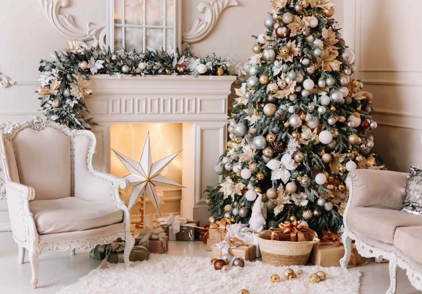
Modern Classic (Elegant, Not Stuffy)
Warm white lights + mixed metals (brass and silver) + deep reds (burgundy, cranberry) + a few creamy neutrals. Add velvet ribbon cascading diagonally rather
than wrapping tightly like a barber pole. Finish with a structured topper (star or oversized bow).
Scandi Cozy (Simple, Warm, Textured)
Soft warm lights + natural materials like wood, felt, paper, and dried orange slices. Keep ornaments sparse and let the tree breathe. Add simple garland
(wooden beads or fabric ribbon) and a minimal topper. This style is especially forgiving if you don’t want a “busy” room.
Vintage Kitsch (Tacky, But on Purpose)
Choose a retro theme: bright colors, shiny baubles, playful ornaments, maybe even tinselyes, really. The key is consistency: pick a decade vibe and repeat it.
Keep the lights one temperature, use ornament clusters in a few repeating zones, and avoid mixing random modern pieces that break the illusion.
Quick Checklist: The Fastest Ways to Fix a Tacky Tree
- Upgrade the glow: add more lights, weave them inward, keep bulb tone consistent.
- Swap the shine: reduce glossy plastics; add matte, velvet, glass, or metallic accents.
- Edit the chaos: remove the “random” ornaments first; keep a palette and repeat it.
- Right-size the details: smaller ornaments near the top, larger ones lower and deeper.
- Fix the base: use a tree collar or skirt, hide cords, add wrapped boxes for structure.
- Make ribbon work: cascade or weave itdon’t strangle the tree in tight spirals.
Real-World Experiences: What Actually Happens When People “De-Tackify” a Tree (500+ Words)
If you’ve ever tried to “fix” a Christmas tree, you already know the emotional stakes are higher than they should be. It’s not just decorit’s tradition, nostalgia,
and the annual question of why the tree suddenly looks smaller the moment you start decorating. Here are a few common real-world scenarios people run into, and the
surprisingly simple moves that change everything.
The “I Bought a Matching Set and It Still Looks Off” Moment
Someone decides to be organized this year. They buy a coordinated ornament set in one color. They hang every ornament neatly. And somehow the tree looks… flat.
Not bad, exactlyjust oddly lifeless, like it’s wearing a perfectly pressed outfit with no jewelry. The fix tends to be adding contrast in texture and size:
swapping in a few oversized ornaments, mixing matte and shiny finishes, and introducing one accent material (like velvet ribbon or metallic picks). The tree doesn’t
need more stuff; it needs depth.
The “Too Many Memories” Overload
Another classic experience: the sentimental ornament collection has grown for yearsschool crafts, travel souvenirs, quirky gifts. Each one feels non-negotiable.
But together, they create visual noise, especially if they’re all on the front-facing outer branches. A gentle solution is zoning: put the most meaningful pieces
at eye level where people gather, cluster some novelty ornaments on one side (like a “memory corner”), and use neutral filler ornaments to calm the overall look.
The tree becomes readable againlike a playlist with a vibe instead of 200 songs on shuffle.
The “Tinsel Regret” Spiral
Tinsel regret is real. It usually starts with good intentions (“I want sparkle!”) and ends with the tree looking like it fought with a craft bin and lost.
The experience most people report is that tinsel takes over: it catches the light, dominates photos, and makes ornaments disappear. The easiest rescue is subtraction:
remove most of the tinsel, then reintroduce a little in controlled spotsaround the midsection, or only on the inner branches so it glows subtly instead of shouting.
It’s the same principle as seasoning: a pinch can be magic; the whole shaker is a mistake.
The “My Lights Are Weird but I Can’t Explain Why” Problem
Many people don’t realize lighting can make or break the tree until they see it fixed. The common experience: the tree looks fine in the day, but at night it feels
harsh, spotty, or oddly yellow-blue depending on where you stand. Usually it’s mixed bulb temperatures or lights wrapped only on the outer edges. The upgrade is
methodical: turn off the overhead room lights, add more strands, and weave lights inward so the branches glow from the center. Once the lighting is even, ornaments
look more expensivewithout changing a single ornament.
The “I Tried to Copy a Designer Tree and It Didn’t Work in My House” Reality Check
A designer tree online might be gorgeous, but real homes have different ceilings, wall colors, and furniture. People often find that copying a look exactly can feel
forcedlike wearing runway clothes to the grocery store. The better experience is borrowing the method rather than the exact style: pick a palette that complements
your room, scale ornaments to your tree size, and choose a topper and skirt that match your home’s overall vibe. When the tree speaks the same “design language” as
the room, it stops feeling like a temporary prop and starts feeling like it belongs.
The big takeaway from these experiences is comforting: most “tacky” trees aren’t doomed. They’re just missing a plan, a little editing, or better lighting.
And the goal isn’t perfectionit’s a tree that feels festive, personal, and intentional enough that you don’t side-eye it every time you walk past.