Table of Contents >> Show >> Hide
- What You Need Before You Start
- How to Paint a Simple City Scene in 10 Steps
- Step 1: Choose a Simple Reference and Simplify It
- Step 2: Draw the Horizon Line and Vanishing Point
- Step 3: Block In the Biggest Shapes First
- Step 4: Paint the Sky and Background First
- Step 5: Paint the Farthest Buildings in Simple, Muted Colors
- Step 6: Build the Middle Ground and Main Structures
- Step 7: Add the Street, Sidewalks, and Ground Shadows
- Step 8: Add Windows and Architectural Details Selectively
- Step 9: Add Life with Small Storytelling Elements
- Step 10: Finish with Highlights, Contrast, and Edges
- Common Mistakes Beginners Make in Cityscape Painting
- Easy Color Ideas for a Simple City Scene
- Experience: What Painting a Simple City Scene Really Teaches You
- Conclusion
- SEO Tags
If you have ever looked at a city skyline and thought, “That looks amazing, but also suspiciously complicated,” welcome to the club. The good news is that a simple city scene does not require a fine arts degree, a beret, or the ability to say “atmospheric perspective” without sounding dramatic. It mostly requires a smart plan, a few basic supplies, and the willingness to let rectangles become buildings. That is really the whole magic trick.
A beginner-friendly cityscape painting works best when you keep three ideas in mind: simple shapes, clear depth, and controlled detail. In other words, do not try to paint every brick, every window, and every tiny pedestrian who looks like they are late for work. A strong city scene painting is built from the big structure first. Once the layout feels right, the smaller details start working for you instead of against you.
In this step-by-step guide, you will learn how to paint a simple city scene in a way that feels approachable, fun, and polished. This method works especially well with acrylic paint, but the same basic process can also help if you prefer gouache or mixed media. The goal is not to make a perfect postcard. The goal is to create a cityscape that feels lively, balanced, and unmistakably yours.
What You Need Before You Start
Before you paint your urban masterpiece, gather a few basics. Keep it simple. You do not need a studio that looks like a movie set.
- Canvas, canvas pad, or thick mixed-media paper
- Acrylic paints in a limited palette
- One flat brush, one medium round brush, and one small detail brush
- Pencil and ruler
- Water cup and paper towels or a rag
- Palette or plate for mixing paint
- An optional photo reference of a street, skyline, or downtown block
A limited palette is your best friend here. Try titanium white, black, ultramarine blue, yellow ochre, a warm red, and one neutral gray or brown. With those colors, you can mix sky tones, shadow colors, warm building lights, and street-level accents without turning your palette into a chaotic rainbow soup.
How to Paint a Simple City Scene in 10 Steps
Step 1: Choose a Simple Reference and Simplify It
The easiest way to begin a simple cityscape painting is to choose a reference with a clear street view or skyline. Look for obvious building shapes, a strong horizon line, and a scene that is not packed with visual clutter. A downtown street, a bridge with buildings behind it, or a row of storefronts is much easier to paint than a mega-complex aerial view with seventeen skyscrapers battling for attention.
Once you have a reference, simplify it. Squint at the scene and ask yourself what the biggest shapes are. Usually, you will see sky, a few major buildings, a road or sidewalk, and a small handful of dark and light areas. Those are your real starting points. If you begin by obsessing over windows, you are skipping ahead in the movie and missing the plot.
Step 2: Draw the Horizon Line and Vanishing Point
This is where your city scene starts to make visual sense. Draw a horizon line across your paper or canvas. Then place a vanishing point somewhere on that line. If you are painting a simple street scene, one-point perspective is usually enough. That means many lines on roads, sidewalks, rooftops, and building edges will angle toward that single point.
Do not panic if perspective sounds intimidating. Think of it as a tool for making flat shapes feel like they live in real space. A few lightly sketched guide lines can instantly make your cityscape look more believable. Keep the pencil lines light, because these are instructions, not tattoos.
Step 3: Block In the Biggest Shapes First
Now sketch the major shapes of your city scene. Start with the skyline or building tops, then add the street, sidewalks, and a few main structures. Keep the buildings as rectangles, stacked boxes, and simple rooflines. You are building the bones of the painting, not decorating the cake yet.
This is also the time to think about balance. If every building is the same size and height, the painting can feel stiff. Vary the shapes a bit. Let one structure be tall, another short, another wide. A simple city scene becomes more interesting when the eye has somewhere to travel.
Step 4: Paint the Sky and Background First
In most beginner cityscape painting tutorials, the background comes first for a reason. It is easier to paint the sky before you cut around ten rooftops like you are trimming a hedge with nail scissors. Start with the sky and any faraway background shapes. Use broad strokes and keep this part loose.
If you want a bright daytime scene, mix a soft blue with white and fade it gently as it moves downward. If you want a sunset city painting, blend warm colors near the horizon and cooler tones above. Try not to overmix. A sky with a few visible brush transitions can look lively and painterly. A sky mixed into mush tends to look like your canvas gave up.
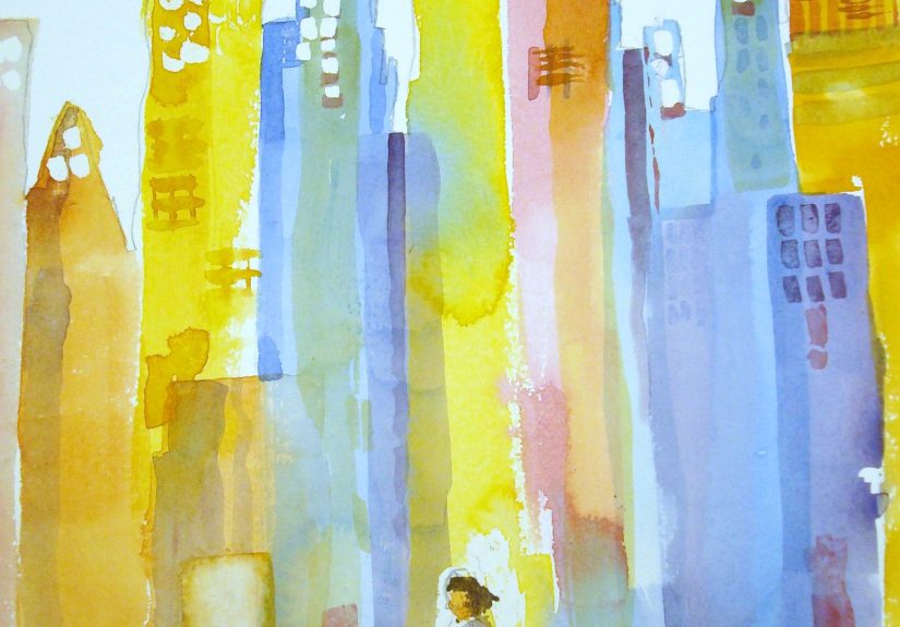
Step 5: Paint the Farthest Buildings in Simple, Muted Colors
Distance matters in a city scene. Buildings that are farther away should usually look lighter, softer, and less detailed than the ones in front. This creates depth without forcing you to perform miracles. Paint distant buildings as flat, simplified shapes. Use cooler or grayer versions of your main colors so they gently sit back in space.
This is one of the most effective beginner painting tricks because it does a lot of work very quickly. If the background buildings are quiet and understated, the middle and foreground can stand out naturally. Think of distant buildings as backup singers. Important, yes. But they should not out-sing the lead.
Step 6: Build the Middle Ground and Main Structures
Next, move into the middle ground. Paint the major buildings that define the scene. This is where your city starts to feel specific. Use slightly stronger color and clearer edges than you used in the background. Follow your perspective lines where needed, especially on roof edges, windows rows, and sidewalks.
At this stage, it helps to focus on planes of light and shadow. Instead of painting one building as a single flat color, break it into simple sections. Maybe one side faces the light and appears warmer. Another side sits in shadow and turns cooler or darker. That small shift gives your buildings form and makes the whole cityscape feel more dimensional.
Step 7: Add the Street, Sidewalks, and Ground Shadows
The street is not just empty filler between buildings. It is one of the best tools for creating depth and movement. Paint roads and sidewalks with long strokes that support the perspective of the scene. Then add shadows under cars, awnings, streetlights, or building edges to anchor objects in place.
This is also a great time to create rhythm. Repeating shapes such as lamp posts, traffic signs, tree trunks, or window lines can lead the eye through the composition. You do not need many. Even a few repeated vertical marks can make the city feel structured and alive.
Step 8: Add Windows and Architectural Details Selectively
This is the step where many beginners go from “nice painting” to “why did I spend forty-five minutes painting 112 identical windows?” The answer is simple: you do not need to. Suggest detail rather than documenting every surface. Paint the most visible windows and architectural lines on your focal buildings, then soften or skip detail elsewhere.
Use a small brush, but stay loose. A row of slightly broken window marks often looks better than perfectly rigid squares. Tiny variations make the painting feel handmade and alive. The same rule applies to fire escapes, signs, roof antennas, and trim. Give the eye enough information to believe the structure is there, then stop before the details start staging a rebellion.
Step 9: Add Life with Small Storytelling Elements
A city scene becomes more engaging when it includes hints of life. Add a few tiny cars, simple tree shapes, streetlights, bicycles, or little walking figures. Keep them small and understated. These details are seasoning, not the whole meal.
A tiny figure in a bright jacket can instantly create scale. A warm yellow window can make a building feel occupied. A red traffic light can pull attention to a focal point. These little touches turn a basic cityscape into a scene with mood. Suddenly, it is not just “buildings.” It is a place where something might be happening.
Step 10: Finish with Highlights, Contrast, and Edges
Step back and look at the whole painting. Where do you want the viewer to look first? That is where you sharpen edges, increase contrast, or add a few crisp highlights. Maybe the edge of a roof catches the sun. Maybe a bright reflection hits a window. Maybe a dark doorway gives your eye a place to land.
This final pass is where you make the scene feel intentional. Do not add highlights everywhere. If everything shouts, nothing gets heard. Save your strongest light, darkest dark, or cleanest edge for the focal area. Then leave a few softer, quieter areas so the painting can breathe.
Common Mistakes Beginners Make in Cityscape Painting
One of the biggest mistakes is trying to paint too much too soon. A simple city scene should stay simple in its early stages. If your first ten minutes look messy, that is normal. Most good paintings go through an awkward phase where they seem convinced they are a bad idea. Keep going.
Another common issue is making every building the same value. If all the shapes are equally dark or equally bright, the city can feel flat. Separate your lights, midtones, and shadows. Even subtle value changes make a huge difference. Also, watch your edges. Crisp edges pull forward, while softer edges recede. That is one reason some buildings should look sharper than others.
Finally, resist the urge to fix everything with more detail. Detail is not a substitute for structure. If the perspective, values, and large shapes are working, the painting will already feel strong. Details should support that foundation, not desperately attempt to rescue it.
Easy Color Ideas for a Simple City Scene
If you are unsure how to choose colors, pick a mood before you pick a palette. For a clean daytime cityscape, use cool grays, blue sky tones, and warm beige or brick accents. For a cozy evening painting, lean into indigo, violet, rusty red, muted teal, and warm yellow lights. For a modern urban look, go with a mostly neutral palette and add one bold accent color such as mustard, coral, or bright blue.
Keeping your palette limited makes the painting feel more unified. That is especially helpful in urban landscape art, where there are already many shapes competing for attention. A city scene with controlled color almost always looks more polished than one trying to include every paint tube you own.
Experience: What Painting a Simple City Scene Really Teaches You
One of the funniest things about learning how to paint a simple city scene is realizing that cities are, at their core, giant collections of boxes with personality issues. From a distance, they look dazzling and impossibly complicated. Up close, the painter learns that most of the visual drama comes from a few repeat ideas: shape, angle, light, shadow, and rhythm. That realization is incredibly freeing for beginners.
In practice, the first city scene often begins with too much ambition. Many new painters try to include every rooftop, every parked car, every reflection, and every last heroic little window. Then the painting starts to feel crowded and stiff. The real breakthrough usually happens when the artist simplifies. You stop painting every object and start painting relationships instead. One building is darker than the sky. One street angle leads to the center. One bright window stands out against a shadowed wall. Suddenly, the scene begins to work.
Another common experience is discovering that perspective is less scary than expected. At first, the horizon line and vanishing point can sound like something from a geometry pop quiz nobody requested. But after using them once or twice, they become comforting. They give order to the chaos. Instead of guessing where the sidewalk goes or why the road looks crooked, you have a quiet little map underneath the painting. It is not restrictive. It is helpful. It is the difference between wandering through a city and having a decent GPS.
Painting city scenes also teaches patience with layers. A beginner often wants the final result in the first pass. Unfortunately, paintings do not usually cooperate. The sky might go down first, then the distant buildings, then the larger structures, then the shadows, then the details. Each layer makes the next one easier. This is where a lot of confidence comes from. You begin to trust the process. A half-finished painting may look awkward, but that does not mean it is failing. It just means it is half-finished, which is a very different emotional event.
There is also a surprising storytelling element to cityscape painting. Even a simple scene can suggest a time of day, a season, or a mood. A cool gray street with soft blue windows feels quiet and early. A scene with orange sky reflections and glowing storefronts feels warm and busy. A rainy sidewalk with blurred lights feels cinematic in the best possible way. The more you paint city scenes, the more you realize you are not only painting buildings. You are painting atmosphere, memory, and movement.
Most of all, painting a simple city scene teaches restraint. You learn that not every area needs equal detail, not every line needs to be perfect, and not every mistake deserves a dramatic reaction. Sometimes a loose brushstroke on a distant rooftop does more than five minutes of overworking. Sometimes the best window is just one small dash of light. And sometimes the painting comes together the moment you stop fussing with it. Cities may be busy places, but a good cityscape often succeeds because the painter knows when to keep things calm.
Conclusion
If you want to paint a simple city scene, the secret is not magical talent. It is sequence. Start with a clear reference, set up your perspective, block in the biggest shapes, and build the scene from background to foreground. Keep your colors controlled, your details selective, and your focal point strong. That approach makes cityscape painting far more manageable and much more enjoyable.
So yes, you can absolutely paint a city scene without losing your mind, your ruler, or your patience. Begin with the basics, trust the layers, and let the rectangles do their thing. Before long, your canvas will look less like random geometry and more like a place people would actually want to walk through.