Table of Contents >> Show >> Hide
- What a Whole-House Palette Is (and What It Isn’t)
- Start With What You Can’t Change
- Pick One “Thread Color” to Tie Everything Together
- Undertones: The Sneaky Villains (and How to Outsmart Them)
- Choose Your Neutrals: Warm, Cool, or “Dirty” (in a Good Way)
- Decide on Trim, Ceilings, and Doors Early
- Make the Palette Work Room by Room
- Test Paint Like You Mean It
- Use Digital Tools (Because It’s 2026 and We Deserve Nice Things)
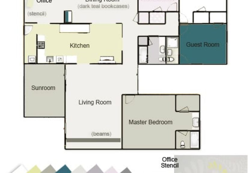
- Four Whole-House Palette Examples (Steal the Structure, Not the Exact Shades)
- Common Mistakes (So You Don’t Have to Learn the Hard Way)
- Conclusion: Cohesion Is a Strategy, Not a Beige Requirement
- of Real-Life Experience With a Whole-House Palette
Picking paint colors for one room is fun. Picking paint colors for an entire house is how perfectly reasonable people end up
standing in a hallway at 10:47 p.m. whispering, “Is this… beige? Or is it aggressively greige?” If you’ve ever felt personally
attacked by a wall of paint chips, welcome. This is the calmer, more cohesive way through.
A whole house color palette is basically your home’s “playlist”: a small, curated set of colors that repeat and remix from room to room so
everything flowseven if your life does not. Done right, it makes decorating easier, transitions smoother, and your house feel intentionally
put together (instead of “each room was a separate emotional era”).
What a Whole-House Palette Is (and What It Isn’t)
A whole-house palette is a limited collection of paint colors you can use across the home: a dominant wall color, a few supporting colors,
a consistent trim/ceiling white, and one or two accents for doors, built-ins, or “I’m feeling brave” moments. Think 5–7 total hues,
not 37. It’s not a rule that every room must matchit’s a system that keeps everything related.
It also isn’t a personality test. Your palette can be soft and neutral, bold and moody, or cheerful and colorful. The goal is cohesion:
rooms should look like cousins, not strangers who met at a family reunion and immediately started arguing about undertones.
Start With What You Can’t Change
Before you choose a single paint chip, take inventory of the “fixed features” that will boss you around no matter how many Pinterest boards
you make:
- Floors: wood species, stain, tile, carpet tone
- Counters & stone: veining, speckles, warmth/coolness
- Cabinet finishes: warm oak, cool white, espresso, painted colors
- Large upholstery pieces: sofa, sectional, rugs you’re not replacing soon
- Metal finishes: brushed nickel (cool), brass (warm), black (neutral-ish but bold)
The fastest path to a cohesive whole-home color scheme is choosing paint that harmonizes with these permanent materials. If your floors are
warm honey oak, icy gray walls can look like they’re fighting. If your counters have cool gray veining, super-creamy yellow whites might
feel “off” in certain light.
Pick One “Thread Color” to Tie Everything Together
Designers often start by finding your “happy colors”the hues you naturally gravitate toward in clothing, art, or natureand using that as
the thread that runs through the home. Maybe you love ocean blues, earthy greens, or warm clay tones. That thread can show up as a wall color
in one room, a cabinet color in another, and accent decor elsewhere.
This doesn’t mean painting every room blue. It means creating a color story: the home feels related because you repeat a few tones and keep
the undertones compatible.
Undertones: The Sneaky Villains (and How to Outsmart Them)
Undertones are why “white” can look pink in one room and green in another. The top color you see (beige, gray, white) is the masstone.
The underlying bias (yellow, green, violet, etc.) is the undertoneand it changes depending on lighting, surrounding finishes, and even what
you ate for lunch (kidding… mostly).
Three practical ways to spot undertones
- Compare it to a “true” reference: Put your sample next to a known neutral/true hue. Subtle biases become obvious fast.
-
Test near fixed finishes: Hold the sample against flooring, counters, and tile. If it suddenly looks pink/green/purple,
that’s undertone drama. - Watch it across the day: Morning light, afternoon sun, and nighttime bulbs each change color perception.
The biggest whole-house mistake is mixing undertone familieslike pairing a cool, blue-based gray in the hallway with a warm, yellow-based
“cream” in the living room. It can look like two different houses sharing a mortgage.
Choose Your Neutrals: Warm, Cool, or “Dirty” (in a Good Way)
Most whole-house palettes start with neutrals because they’re flexible. But “neutral” isn’t one thing. Warm neutrals lean yellow/red/orange,
while cool neutrals lean green/blue/violet. If you want cozy and inviting, warm neutrals tend to do the heavy lifting. If you want airy and
crisp, cooler neutrals are often the move.
Lately, a lot of designers love so-called dirty neutralscomplex, earthy shades like mushroom, greige, cognac, and olive that
feel lived-in rather than sterile. They’re forgiving, they shift beautifully with light, and they tend to play well with natural materials
like wood, linen, and stone.
A simple neutral framework that works almost anywhere
- Base neutral (walls): the main “everywhere” color
- Bright neutral (trim/ceilings): a consistent white that reads clean with your base
- Deep neutral (doors/built-ins): a grounded shade for structure and contrast
This “three-color architecture” gives your home instant polish: walls feel intentional, trim looks crisp, and doors don’t disappear like
shy little rectangles.
Decide on Trim, Ceilings, and Doors Early
If you want your whole-house palette to feel professional, make one decision and repeat it:
use the same trim color throughout the main living areas (and ideally the same ceiling white too). This creates visual
continuity as you move from space to space.
Trim strategy options
- Classic: crisp white trim + neutral walls (clean, timeless)
- Soft contrast: slightly warmer/creamier trim with warm walls (cozy, traditional)
- Modern: white walls + darker trim/doors (graphic, architectural)
- Color-drenched: walls + trim + doors in one family (dramatic, enveloping)
Doors are the underrated secret weapon. If you paint interior doors a deeper tone than the walls, you add instant depth and “custom home”
energywithout needing a single shiplap plank.
Make the Palette Work Room by Room
Cohesion doesn’t mean every room is the same shade. It means each room is a variation that fits into the same family. Here’s how to think
about it in real spaces.
Open floor plans: zone without chaos
In open layouts, color can “zone” areaskitchen, dining, livingwithout putting up walls. The trick is to use complementary tones:
maybe the main neutral carries through, while one area gets a slightly deeper or more saturated supporting color to define the zone.
Hallways and transitions: keep them quiet
Hallways are connective tissue. A calm, versatile wall color here makes every adjacent room feel more intentional. If you want bold rooms,
let them be bold, but keep the transitions soothing so your eyes can rest.
Bedrooms: turn the volume down
Bedrooms love softer, lower-contrast palettes: muted blues, gentle greens, warm off-whites, or cozy taupes. If the rest of the house is
neutral, bedrooms can be your “sleeper hits” (pun intended): slightly more color, still harmonious.
Bathrooms: match the hard finishes
Bathrooms have a lot of tile, stone, and shiny surfaces. Choose paint that harmonizes with the tile undertone. A mismatch here stands out fast
because there’s nowhere for the paint to hide.
Living rooms: mood matters
Want airy and open? Lighter, softer shades help reflect light. Want cozy and intimate? Moody colors like navy or deep green create a
cocooning effect. Decide the vibe first, then choose from your palette accordingly.
Test Paint Like You Mean It
Paint is famous for looking different on a wall than on a chip. So don’t “pick a color.” audition it.
Use sample pots or peel-and-stick samples, and place them near the most important permanent features (floors, counters, cabinetry).
Testing checklist
- Try at least 3–5 close contenders (you’ll notice differences you didn’t expect).
- Paint a large swatch and do two coats for accuracy.
- Check it in morning, afternoon, and at night under your actual bulbs.
- Move the sample around the roomlight changes by wall.
Then do one last, surprisingly effective trick: step back and squint. If one color jumps out like it’s yelling,
it might not belong. If everything blurs together harmoniously, your palette is doing its job.
Use Digital Tools (Because It’s 2026 and We Deserve Nice Things)
You can absolutely build a whole-house palette the old-fashioned way: paint chips, good lighting, and a stubborn refusal to be rushed.
But digital tools can help you narrow the field:
- Photo matching: Upload or snap an inspiration photo and pull coordinating paint colors from it.
- Visualizers: Try colors on sample rooms or upload a photo of your space to preview (not perfect, but helpful).
- Palette builders: Save a set of colors so you can reuse them room by room.
Use these tools for direction, then confirm with real samples. Screens are liars. Charming liars, but liars nonetheless.
Four Whole-House Palette Examples (Steal the Structure, Not the Exact Shades)
The best part of a whole-home color scheme is the repeatable structure. Below are examples you can adapt using your preferred brand.
The color names are optional; the relationships are the point.
1) Warm Modern Neutral (inviting, flexible, timeless)
- Walls: warm greige or soft taupe (mid-light)
- Trim/Ceiling: clean warm white
- Accent 1: muted olive or sage (built-ins, mudroom, powder room)
- Accent 2: warm terracotta or clay (art wall, pantry door, small hallway)
- Deep neutral: charcoal-brown or soft black (interior doors)
Why it works: warm undertones connect with wood floors and natural textures. Accents feel groundednot like they showed up to the wrong party.
2) Cool Coastal (bright, breezy, not “beach souvenir shop”)
- Walls: soft white or very light gray with a cool undertone
- Secondary: pale blue-gray (bedrooms, office)
- Statement: blue-green “water” tone (a soft shade like the spa-inspired blue-green family)
- Trim/Ceiling: crisp white
- Deep anchor: navy (doors, dining, or a cozy den)
Why it works: the palette stays in the same cool family, so transitions feel smooth even when the colors change.
3) Earthy & Organic (calming, restorative, “touch grass” energy)
- Walls: warm off-white or light mushroom
- Secondary: warm gray (stone-friendly)
- Accent 1: eucalyptus green (bedroom or kitchen island)
- Accent 2: muted copper/rust (entry, powder room, built-in niche)
- Trim: soft white (not stark)
Why it works: earth tones naturally harmonize, especially with wood, rattan, clay, and linen. The vibe is “serene,” not “hospital waiting room.”
4) Bold but Livable (for color lovers who still want flow)
- Base neutral: a balanced off-white
- Supporting: mid-tone warm neutral (hallways, connecting areas)
- Hero colors: two saturated hues (e.g., deep green + moody plum) used strategically
- Trim: consistent white to keep edges clean
- Deep neutral: near-black for doors or a library/den
Why it works: bold colors feel intentional when they’re anchored by repeat neutrals and consistent trim. It’s maximalist… with manners.
Common Mistakes (So You Don’t Have to Learn the Hard Way)
- Changing whites every room: One room’s “white” is another room’s “why is this mint?” Pick one and repeat it.
- Ignoring lighting temperature: Warm bulbs + cool paint can look muddy. Cool bulbs + warm paint can look jaundiced. Choose bulbs intentionally.
- Over-collecting colors: If your palette needs a spreadsheet and a support group, it’s too big.
- Forgetting sheen: The same color can look different in matte vs eggshell vs satin. Decide finishes early.
- Skipping real testing: If you only looked at the chip under fluorescent store lighting, you did not “test.” You “hoped.”
Conclusion: Cohesion Is a Strategy, Not a Beige Requirement
A whole house color palette isn’t about playing it safe. It’s about making deliberate choices that repeat across your home so everything
looks connected. Start with your fixed finishes, choose a consistent undertone direction, lock in trim, and build a small set of colors you
can remix room to room. The payoff is huge: fewer decisions, fewer mistakes, and a home that feels like one complete story.
of Real-Life Experience With a Whole-House Palette
Here’s the part nobody tells you until you’re living with it: a whole-house palette doesn’t just make your home look betterit makes your
brain feel better. Decision fatigue is real, and paint decisions multiply like rabbits. When you have a palette, you stop
re-deciding the same question in every room. You already know your trim white. You already know your hallway neutral. You already know your
“door color that makes everything look expensive.” Suddenly, the painting process goes from “chaotic art project” to “repeatable system.”
The first experience most homeowners share is the swatch wall era. You put up three or five contenders and think,
“These all look identical.” Then the sun moves five feet and one of them turns faintly lavender and you realize you’ve been living in
Undertone Denial your whole life. This is normal. It’s also the moment you start trusting testing more than online photos, because the
internet cannot show you how your north-facing living room politely refuses warm paint.
The second experience is the unexpected hero color. Maybe you thought you were a “cool gray person,” but the warm greige
sample makes your floors look richer and your sofa look intentional instead of “I bought this in a panic.” Or you planned to keep everything
neutral, and then you paint one small powder room a moody green and suddenly you understand why people write poems about bathrooms. A palette
gives you permission to be bold in the right places because you’re anchored everywhere else.
Third: you start noticing transitions. You realize the hallway isn’t just “a hallway”it’s the runway your rooms walk down.
If the hallway color is calm, both rooms on either side look more confident. If the hallway color is chaotic, everything looks slightly
confused, like your house forgot what the assignment was.
Fourth: you learn that doors matter. Painting doors a deeper neutral is one of those upgrades that feels minor until it’s
donethen it looks like you hired someone who owns a tiny tape measure and says things like “architectural continuity.” Doors become
intentional punctuation marks instead of random shapes.
Finally, the most relatable experience: your palette will still surprise you seasonally. Winter light makes colors feel cooler; summer light
warms them up. The good news? If your undertones are consistent, those shifts feel like mood lightingnot like your walls changed teams.
And that’s the real win: your home feels cohesive through all the light changes, furniture swaps, and life messes. The palette holds the
story together, even when your laundry situation does not.