Table of Contents >> Show >> Hide
- Why This Philadelphia Studio Kitchen Works So Well
- The Design DNA: What Defines the Look
- How to Recreate the Look Without Copying It Blindly
- Small-Space Lessons Hidden Inside This Kitchen
- The Palette: Calm, Collected, and Slightly Moody
- Where to Spend and Where to Save
- A Steal-This-Look Checklist
- What It Feels Like to Live With a Kitchen Like This
- Final Take
Some kitchens are designed for cooking. Some are designed for looking good in photos. And then there are the rare overachievers that do both without breaking a sweat. That is the magic of this perfected studio kitchen in Philadelphia: it feels polished enough to star in a design magazine, practical enough to survive a serious dinner prep session, and relaxed enough to host a late-night glass of wine without acting precious about it.
The appeal of this look comes from its balance. It is not trying to be a country farmhouse, a sterile showroom, or a moody chef’s cave. Instead, it lands in that sweet spot where warmth, utility, and style all share the same zip code. Think pale gray cabinetry, marble with movement, wood that softens the room, industrial touches that add backbone, and lighting that knows how to flatter a countertop. In other words, this is a Philadelphia studio kitchen with excellent manners and a little edge.
If you want to steal this look for your own home, rental, studio, or glorified shoebox with a refrigerator, the good news is that the formula is surprisingly adaptable. You do not need a giant footprint or an unlimited budget. You need restraint, a strong material palette, and the discipline to choose a few standout details instead of making every surface scream for attention. Let the backsplash have a moment. Let the hood look sculptural. Let the hardware act cool. The rest can quietly do its job.
Why This Philadelphia Studio Kitchen Works So Well
The original inspiration is memorable because it was built to serve more than one purpose. It functioned as a studio kitchen, a prep space, a design backdrop, and an occasional entertaining zone. That kind of multitasking changes the way a kitchen has to perform. It cannot simply be pretty from one angle. It needs to look good from every angle, move efficiently, and hold up under real use.
That is why the layout feels so smart. The kitchen is arranged with a sense of workflow, not just visual drama. The sink, cooking zone, and refrigeration area work together instead of fighting like siblings on a road trip. The island adds prep space and utility without becoming a hulking obstacle. There is a reason designers still talk about kitchen flow: a beautiful room becomes annoying very quickly if you have to sidestep a stool every time you reach for olive oil.
Just as important, the room avoids two common small-kitchen mistakes. First, it does not overcrowd the eye. Second, it does not underdeliver on personality. Too many compact kitchens go in one of two directions: plain to the point of sadness, or so overloaded with “special moments” that they feel like a sample board exploded. This one stays calm. The cabinetry is clean. The palette is soft. Then a few stronger choiceslike a more industrial hood, dark hardware, open shelving, and tactile wood detailskeep the space from drifting into bland territory.
The Design DNA: What Defines the Look
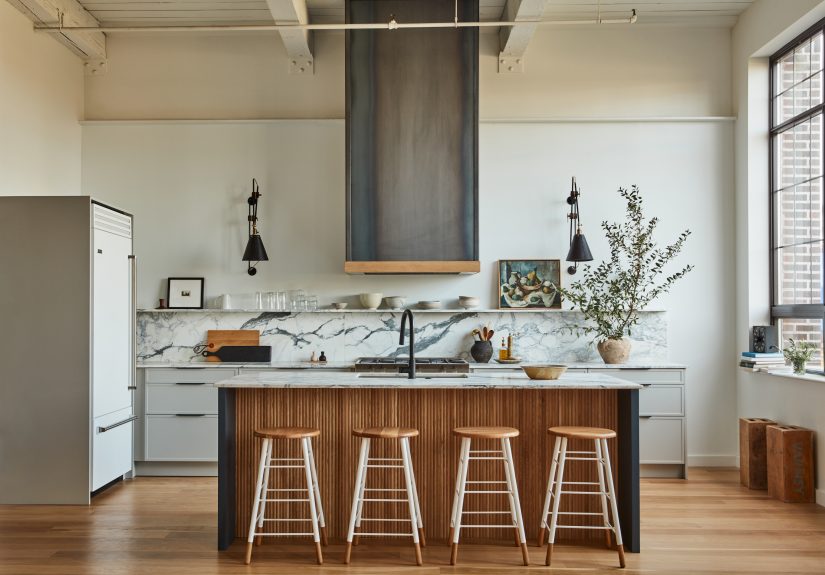
1. Soft cabinetry with structure
The cabinets are the quiet heroes here. Their pale gray tone keeps the kitchen bright without going full hospital-white, and the door style adds just enough detail to feel tailored. This is the kind of cabinet choice that whispers, “I have taste,” instead of shouting it from across the room. If you want a similar effect, look for slim Shaker-style or modern framed fronts in a soft neutral such as warm gray, putty, mushroom, or greige.
2. Marble that earns its keep
A veined marble counter and backsplash immediately elevate the room, but the real trick is how they are used. The stone is not there simply to announce luxury. It also reflects light, gives the room visual continuity, and adds soft movement against the more linear elements. If true marble is out of budget or too high-maintenance for your lifestyle, a quartz slab with gentle veining can create a similar effect. The keyword here is gentle. In a smaller kitchen, wild stone patterns can start acting like the loudest guest at dinner.
3. Wood for warmth
Without wood, this kitchen might tip too far into polished territory. With wood, it exhales. White oak flooring, warm stool tones, reeded millwork, or open shelving keep the room grounded. This matters in a studio kitchen especially, where the line between functional workspace and living space is thin. Wood is the diplomatic peacemaker that helps the kitchen belong to the whole room instead of feeling like a detached appliance zone.
4. Industrial accents in small doses
One of the smartest choices in this look is the harder-edged metal moment around the hood and fixtures. It gives the kitchen some backbone. Without it, all the softness could become sleepy. With it, the room gets contrast and confidence. The lesson is simple: every beautiful kitchen benefits from one element that brings tension. Maybe it is black pulls, a steel hood surround, a matte faucet, or a pair of pared-back sconces. You do not need an entire factory aesthetic. Just enough grit to keep the room honest.
How to Recreate the Look Without Copying It Blindly
Stealing a look should never mean cloning a room like a design robot. The smartest version of this kitchen is one that borrows the principles, then adjusts them for your own space. If your kitchen is long and narrow, lean into the galley logic. If it is open to a dining area, use materials and lighting to connect the zones. If it is basically one wall plus a prayer, focus on continuity and storage.
Start with the bones. Choose cabinetry that feels visually quiet. Then pick one main countertop-and-backsplash story. After that, layer in warmth through wood and mood through lighting. Only once those big decisions are locked in should you choose decorative details like hardware, stools, art, or shelf styling. That order matters. People often start with the “fun” details and then wonder why the room feels disjointed. Kitchens are not charcuterie boards. You cannot just toss on a little of everything and hope it becomes chic.
Small-Space Lessons Hidden Inside This Kitchen
This Philadelphia studio kitchen is especially useful because it doubles as a master class in making a compact footprint feel bigger. The first lesson is visual continuity. Matching or closely coordinating the cabinetry, refrigerator surround, and backsplash helps the room read as one composed environment instead of a collection of unrelated objects. That is why panel-ready appliances, slab or lightly detailed fronts, and continuous stone look so effective in smaller kitchens.
The second lesson is strategic openness. Open shelving works here because it is selective, not chaotic. A shelf or two can keep a room feeling airy and provide a place for everyday dishes, glassware, art, or a handsome still life. But this only works if you edit. Open shelves are not where every promotional mug from the last decade goes to retire. They are where beauty and utility shake hands.
The third lesson is layered lighting. A studio kitchen cannot rely on one heroic ceiling fixture and call it a day. It needs ambient light, task light, and a bit of decorative glow. Pendants or a flush-mount establish presence. Under-cabinet or shelf lighting improves function. Sconces or accent lighting add intimacy. Good lighting is what makes marble gleam, paint look richer, and late-night leftovers feel vaguely cinematic.
The Palette: Calm, Collected, and Slightly Moody
If you want this look to feel expensive, resist the urge to introduce too many colors. The best version of this kitchen sticks to a restrained palette: soft gray or warm neutral cabinetry, white or off-white stone, wood tones, black or dark metal accents, and one deeper color for depth. In the original inspiration, subtle blue and navy moments help keep the space from feeling flat. That is a clever move. A small kitchen does not need bright chaos to feel alive. It needs one well-placed deep note.
This palette works especially well in Philadelphia-style spaces because so many interiors there benefit from contrast between historic character and practical renovation. Old brick, metal-framed windows, or loft-like architecture pair beautifully with a kitchen that feels tailored but not stuffy. The city itself has that balance: artistic, lived-in, handsome, and not overly polished. A kitchen inspired by Philadelphia should have some texture in its soul.
Where to Spend and Where to Save
If you are trying to recreate this perfected studio kitchen without spending “custom millwork in a dramatic zip code” money, prioritize the pieces that do the most visual lifting. Spend on counters if you can, because they cover a lot of territory and instantly affect how the whole kitchen reads. Spend on hardware and a faucet, because hands and eyes notice those constantly. Spend on lighting, because cheap lighting can make a beautiful kitchen look tired.
Save on cabinet boxes by using well-made stock systems. Save on stools if you can find simple wood or metal designs with clean lines. Save on styling by using what you already own: a cutting board with great grain, stackable white dishes, a ceramic bowl full of lemons, a framed small artwork that looks like it accidentally wandered into the kitchen and decided to stay. That is the vibe.
And if a full slab backsplash is not in the cards, use an affordable tile with enough surface variation to feel rich. The goal is not to pretend every kitchen is luxury-grade. The goal is to create a kitchen that looks deliberate, feels polished, and functions beautifully. Design confidence is often more convincing than budget anyway.
A Steal-This-Look Checklist
- Paintable or slim Shaker-style cabinet fronts in a pale warm gray
- White or softly veined stone counters and backsplash
- White oak or oak-look flooring for warmth
- One industrial touch, such as a steel hood, black pulls, or a matte faucet
- An island or worktable that adds prep space without clogging circulation
- Selective open shelving for everyday pieces and visual breathing room
- Layered lighting: overhead, task, and decorative
- Minimal clutter, maximum texture
What It Feels Like to Live With a Kitchen Like This
Here is the part glossy inspiration posts sometimes skip: what this kind of kitchen actually feels like when you use it. And honestly, that is where the Philadelphia studio kitchen really wins. It feels composed, but not uptight. You can picture a slow morning here with sunlight sliding across the marble, a kettle warming up, and the kind of silence that makes even toast seem a little more sophisticated. The pale cabinetry keeps the room relaxed, while the wood tones and darker accents stop it from feeling chilly. It is a kitchen that wakes up gently.
By midday, the space shifts gears. Because the layout is efficient, moving between sink, stove, and fridge feels easy rather than annoying. That matters more than people think. A kitchen can look spectacular in a photo and still be a nightmare when you are actually trying to chop herbs, rinse produce, and keep a pan from turning your lunch into an edible life lesson. In a well-planned studio kitchen, the surfaces are not just attractive; they are cooperative. The island becomes a landing zone, the shelf keeps the essentials within reach, and nothing feels too precious to touch.
Then there is the social side. This kind of kitchen is made for those low-key, high-quality gatherings where nobody announces they are “entertaining,” but somehow there are olives on the counter, music in the background, and one friend hovering suspiciously close to the cheese. Because the room looks good from multiple angles, it does not shut down when people enter it. It opens up. Guests can perch on stools, lean against the counter, admire the hood, and pretend they have always had very strong opinions about marble movement.
There is also something especially satisfying about a kitchen that doubles as a visual backdrop. In a studio setting, that makes obvious sense for photography or content creation. But even in ordinary life, it matters. A kitchen like this makes everyday rituals feel more intentional. Cutting bread, arranging flowers, plating pasta, or even unloading groceries somehow looks better against a calm, well-edited background. It does not mean life becomes a magazine shoot. It just means the room supports the rhythm of daily life instead of visually interrupting it.
And perhaps the best part is that the beauty here is not loud. It sneaks up on you. At first, you notice the stone, the cabinetry, the lighting. Then later, you realize the real luxury is how settled everything feels. The materials are working together. The storage is doing its job. The room has enough character to feel memorable, but enough restraint to stay livable. In a world full of trend-chasing kitchens that age faster than unrefrigerated whipped cream, that kind of balance is refreshing.
So yes, steal this lookbut steal the feeling as much as the finishes. Borrow the calm. Borrow the discipline. Borrow the confidence to mix practical choices with one or two glamorous ones. A perfected studio kitchen in Philadelphia is not just about copying pale gray cabinets or a sculptural hood. It is about creating a room that feels useful at 7 a.m., beautiful at 7 p.m., and still charming when someone leaves a wineglass by the sink at 11:14. That is not just good design. That is a kitchen with range.
Final Take
The brilliance of this perfected studio kitchen is that it never forces you to choose between beauty and function. It proves that a compact kitchen can feel generous, that practical storage can still look elegant, and that a few carefully chosen materials can carry an entire room. The look is refined but not stiff, current but not trendy, polished but still deeply usable. In short, it is the kind of kitchen many people claim to want and very few rooms actually become.
If you are remodeling, refreshing, or simply plotting your future dream kitchen while standing in a rental with questionable lighting, this is a smart look to study. Keep the palette soft. Let the materials do the heavy lifting. Edit your open shelving. Layer your lighting. Give the room one or two tougher accents so it does not float away on a cloud of beige good intentions. Do that, and you will not just steal the look. You will steal the logic behind itand that is where the real design payoff lives.